

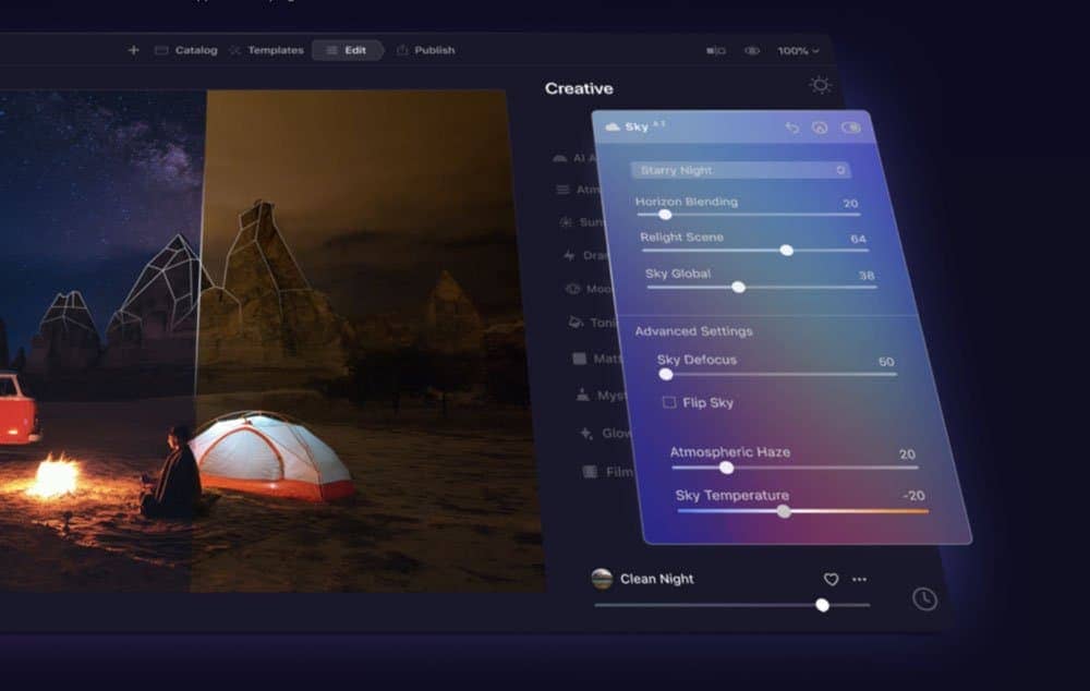
Luminar AI lets you turn your ideas into reality with powerful, intelligent AI. Download the photo editor and see how you can completely transform your photos in a few clicks.
Some of the most advanced Photoshop users still make these beginner mistakes. Find out what these mistakes are and why you should avoid them.
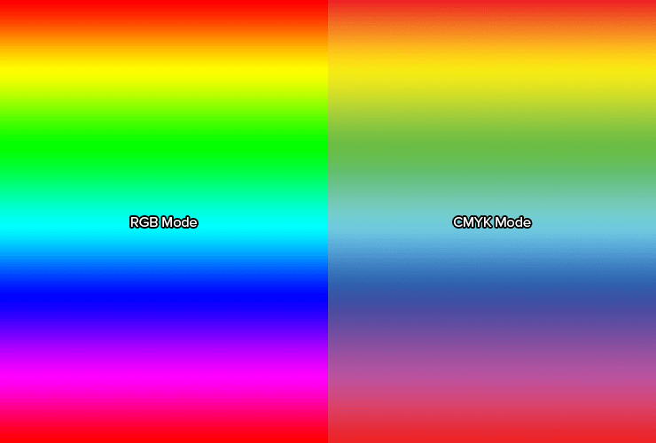
1. Using the wrong image mode and ignoring it
Menus grayed out? Colors don't look right? Don't keep editing when you experience these issues. This is likely caused by using the wrong color mode. Go to your Image > Mode menu and make sure that you're in the correct mode. If you don't know which mode to use, just choose RGB. Ninety-nine percent of the time, your document should be in RGB mode and here's why:
- Anything for the web will be displayed in RGB mode.
- Digital photos are captured in RGB mode and should be edited in RGB mode.
- Many filters and tools are only available in RGB mode.
- You cannot switch between RGB and CMYK mode without a loss in quality. CMYK mode handles color in a completely different way than RGB. CMYK is subtractive, meaning that like paint, colors get darker as you mix them. Whereas RGB is additive like lights and the colors get brighter when mixed.
But what if I plan on printing my work? Shouldn't I use CMYK? The answer is sometimes. For photos, you should never convert them into CMYK mode; always save them as RGB documents. Nearly all printers are designed to handle RGB files and convert them to CMYK using their own printer profiles. In fact, if you have a RGB photo, you'll get better results by letting your printer convert it to CMYK for you instead of doing it yourself in Photoshop.
The best time to use CMYK mode is when you're working on brochures, business cards, and other prints. This is because you can get the exact Pantone color and use speciality inks like spot gloss, silver/gold, and metallic ink. If you pick a color that's 100% cyan and 50% magenta, you'll get exactly that color on your final print. Many printers will tell you what their "rich black" value is. If you use just black ink, it may not appear black enough. Rich black mixes all the inks together to create a black that's darker than just using black ink.

2. Setting the wrong DPI and wondering why your font size is so different
Pixels are pixels right? If you have a 3000x2400 pixel document, you can print a perfect 8x10 photo at 300 DPI so why even bother setting the DPI? This is why:
Measurements. A 32pt font will look much smaller on a 72 DPI document than it does on a 300 DPI document. If you don't set your DPI properly, you'll get the wrong sizes. Also, let's say you want to make a square that will be exactly 1x1 inch on the iPhone 6. How do you do this? First, find out the PPI (Pixels Per Inch) value of the iPhone 6. Take that PPI value (326 PPI) and set it as your DPI in Photoshop. Now when you create a square in Photoshop, you can set it to 1x1 inch and when displayed on your iPhone 6, you'll get a perfect 1x1 square.
12 comments on “Don’t Make These 10 Photoshop Mistakes”
Did anyone find number 9 :P
No. 8 is so me. That's me right there!! lol
Hahahha what a fool. but youre a very good at it!
Nice Tips ..
AMD gpu is better for photoshop.
سلام
جالب بود
گرامی سپاس
Saalim Mohammad
i know (Y) that
Il y a une probleme au niveau du bras (je fais du gfx)
Traktowanie WINDOWSA :p
wow
THANK U FOR THE TIPS SIR