
Download Lightroom presets and LUTs, absolutely free. Use the presets to add creativity and style to your photos.
Your layout should now be looking like this.

Step 7
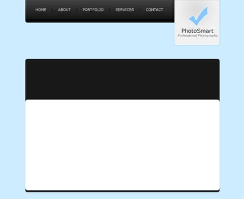
Using the text tool add the name of the site and a small description underneath. I've made up a name "PhotoSmart" for the site and the description is "Professional Photography" - alliteration :) The colorus I have used are #272727 (for the darker colour) and #7b7b7b (for the lighter colour).

Step 8
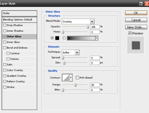
Now we are going to be doing the actual logo of the logo ;) If you don't want to make a shape from scratch for your logo, just use a custom shape from Photoshop. I've filled my tick with the colour #85c7ff and added a small white outer glow (Layer > Layer Style > Outer Glow).

Step 9
Create a new layer (Layer > New > Layer) for the top content background area. Using the rounded rectangle tool make a selection of 860 by 590 pixels and fill (Edit > Fill) with #181818.

Step 10
Create another new layer and make a rounded selection of 860 by 400 pixels at the bottom of the background (leave a 10 pixel margin at the bottom). Fill this selection with white (#FFFFFF).
Step 11
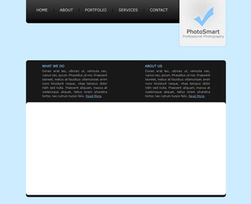
Add in some fill in text for the top content area. The colour I have used for the titles is #85C7FF.
Step 12
Now we are going to be adding a divider between the two paragraphs. On a new layer make a selection of 40 by 180 pixels (however high it is between the top and bottom of the black section). Fill the selection with a linear gradient from #181818 to #1e1e1e using the gradient tool.

Step 13
Duplicate the divider layer and go Edit > Transform > Flip Horizontally. Move the duplicated layer to the right so there is a one pixel gap between the original and the duplicate.

Step 14
Add in some fill in and footer text in the white content area and you are complete.

Final Results
Add some finishing touches, maybe a brush in the background underneath the navigation and you're complete. Click on the image below to see the full version.

2 comments on “Cool Photography Layout”
This Tutorial was so vague I got lost on step 2
nice