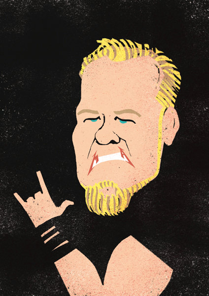
David Bonazzi is a talented Illustrator from Italy. He uses mix digital techniques with textures of scanned found objects in giving his conceptual illustrations a warm and evocative atmosphere. Find out more about Davide’s background, inspiration and learning process in this interview.
When did you start having an interest for digital art?
I wasn’t very much interested in digital art before 5-6 years ago, when I was 24. At that time I used to work with acrylic paintings, pastels, ink, and used to think digital couldn’t make other than cold and geometrical images. I was wrong of course. I became a big fan of Photoshop and other software when I realized I could use them not just to manage an image in post-production but also to draw directly with them, especially with a graphic tablet. The possibility to do lots of changes and manage lines and colors as I wanted gave me a whole freedom of movement and has really changed my way of drawing.
Can you tell us about your learning process? How did you get to where you are now as a designer?
I started studying applied arts pretty late, when I was 25 years old. Before I studied Arts & Humanities both at high school and at the university. Subjects like literature, latin, ancient greek, philosophy, fine arts really helped me in build up a structured critical thinking, which is very useful in my job. However after that degree I needed to learn everything about design and illustration. Since it’s quite hard to find a textbook of all the editorial illustrators from 50’s up to now, one should build up by himself a “map” of contemporary styles, authors, features. When I realized I have enough clear ideas of what I liked, and what I didn’t, what kind of images I’d like to do and how to do them, my stylistic features started taking shape.

For how long have you been doing this and what keeps you going for more?
I’m an editorial illustrator since 2008, but I start drawing since I was a baby. I don’t know why I do that, I think drawing is a kind of language better than words and perfect to express feelings. The more this “visual vocabulary” got better, the more things can be told, that’s the motivation to keep going for more.

Through the years, how did you evolve as an artist?

Your Day Trippers artwork is one of my favorites, what was the experience in creating this piece like? Could you explain the concept behind this artwork?
I just wanted to do a narration focused on everyday life, with normal people as main characters. The story is very minimal, it’s just a day trip of an elderly couple visiting a big city. They don’t do anything special, they just look around, have an ice-cream, relax on a bench, then go home. I just wanted to tell their story with no words, no comments, focusing on their quiet and slow way of living. Everyone can give his personal interpretation of that series.

Leave a Reply