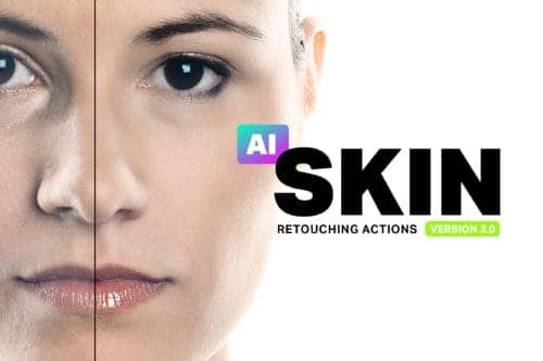
Make skin look perfect in one-click with these AI-powered Photoshop actions.
After 3 years of working there I realized that if I don't do something the exhausting pace of working for others wont give me a lot of opportunities to develop my own work and find my own voice. So, I decided to quit the job after 3 years and go back for my MFA in Graphic Design/Typography and really give myself the opportunity I been looking for. Its only been 18 months since and I have succeeded to make the best of it thus far. I am still experimenting with techniques and content. I'm not sure where it is all going but one thing is for sure, it feels right.
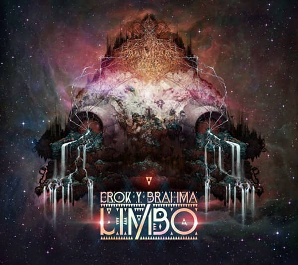
What is a day like for you? What projects or activity usually takes most of your time?
I would say just as much time as I spend creating work, I spend communicating with clients, promoting myself and writing about my work. I have found that being able to successfully discuss my work in a very concise manner helps viewers and other potential clients understand the thought process behind my work. For many clients too much mystery does not sit right.
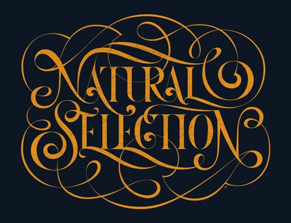
Are there any medium you love to work with? Why?
My two favorite mediums are acrylic and digital. Digital of course allows me to satisfy my desire for extreme and clean detail, while acrylic allows me to capture and understand the value of hand rendered textures. The use of digital medium has also allowed me to experiment and understand how I can use colors in a simple but graphic manner. As you can tell I want to understand how I can create successful pieces that say a lot with the use of very little color or graphic elements, as well as see how much detail is too much detail.
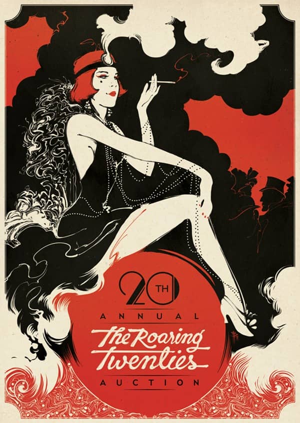
Your typography work are all amazing, with "Dolce Vita" as my personal favorite. What is the work process behind these projects?
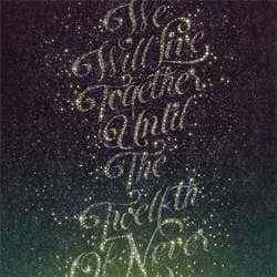
Once I have a certain mood or feeling I want to capture, I come up with a couple or few words that I can use as a starting point of what I want to say. The idea goes beyond being able to read the actual type and understand intellectually what the idea is about. When you read "La Dolce Vita" you will process the words and know that it means "The Sweet Life". That includes a lot of delicacies of life and I can try and list them all. That is not the point as I don't want to be literal. My intent with typography is for you to look at it and have an emotional response to the colors, contrast and the way the letters flow. By not being literal and simply implying a sensual feeling it allows you to look at La Dolce Vita lettering and have your own interpretation of it.
