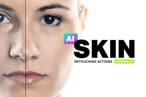
Make skin look perfect in one-click with these AI-powered Photoshop actions.
You do illustrations, graphic design and photography. Does your work have a common theme or a signature style that link them to you as the designer?
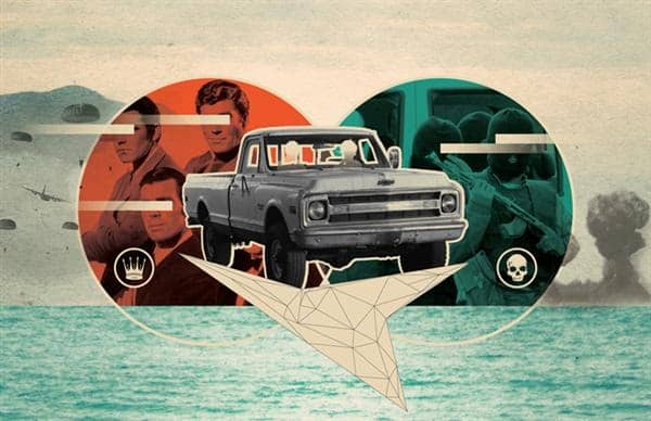
It's true. I'm part designer, part illustrator, part photographer. At the end of the day, I just like to be creative. Whether it's with a mouse, brush, or lens I'm trying to figure out how to maximize my creativity and push myself to try new things. I think this can be seen in the body of work supplied here, it's all over the place! While I tried to limit the projects shown to the ones that I most incorporated Photoshop in (since this is a Photoshop blog), the truth is I am most interested in combining raster images (Photoshop) with vector (Illustrator) and type (InDesign). So I'm constantly switching between these programs to get the most out of what each specializes in. I feel that I am too early on in my career to be limited by a signature style or common theme. I have so much more to learn first! Instead, I'm trying to spend my time doing a wide range of work, which I hope in time will help me develop a unique style of my own. At the end of the day, I just want the work that I produce to be of the highest quality possible and to make sure that it is able to stand up to similar projects in the field.
You are also into typography. What is it about it that you like?
I love typography. Love it. I did not always feel this way though. Early on in my design career I really didn't understand the art behind a carefully laid out page of type. I just wanted to create awesome illustrations! Type be damned! Later, as I worked with type more and more and realized just how difficult it is to make type "sing" on a page and THIS is when I fell in love. I didn't realize it then, but the craft of typography is something you can truly spend a lifetime trying to perfect.
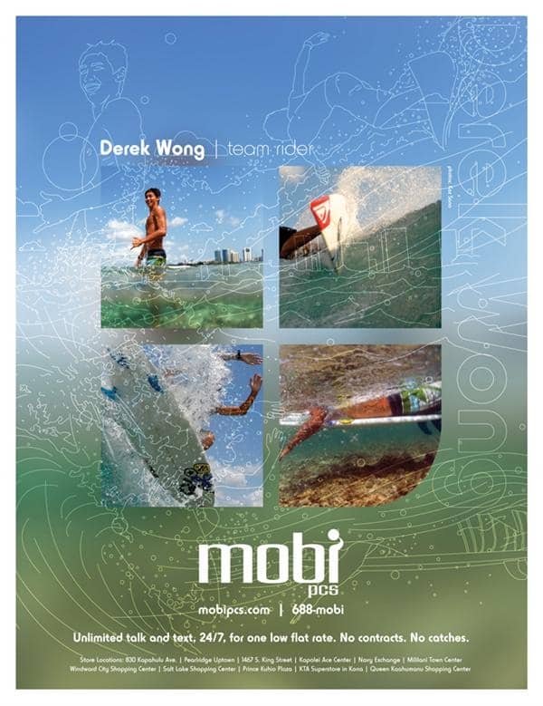
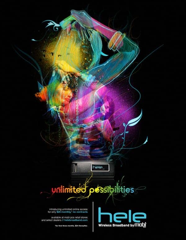
Which project can you say you had the most fun doing?
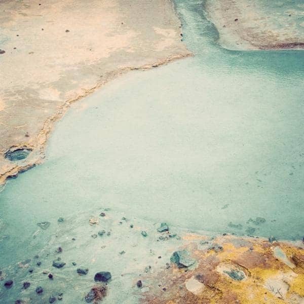
The project I had the most fun doing would be my Visual Mixtape poster series. Here I was able to combine some of the things I love most in life: photography, typography, and music. The project was born from being fed up with a client complaining that certain typographic elements on a page were simply "too small" for her tastes. So, that night the Visual Mixtape was born, filled with type at a size that I felt was beautiful. From there I created a type system that would be able to house all the information from 25 of my (then) favorite albums. I was also able to incorporate some of my favorite photographs that I have taken throughout the years as backgrounds as well. So we are clear, these posters are meant to be subtle and enjoyed from a close distance and perhaps most importantly, they are not trying to sell you anything. I enjoy the irony of this because the posters that I'm usually working on are trying their best to capture both your attention and your wallet. Furthermore, I'm always interested in projects that blur the line between what is considered design and what is considered art.
