Create “Ice cream” Text effect in Adobe Photoshop by using simple tools: layer styles, brushes and stock photos. It’s great way to make your typography more interesting and yummy!
The Final Results
This tutorial shows you how to create yummy typography. You’ll need Photoshop CS5 or newer to follow this tutorial.

Tutorial Resources
- VAL font
- Bokeh – koko-stock
- Image 3 – food – CGtextures
Step 1
Create new file (File > New, or Ctrl + N) 1600×1200 px.

Step 2
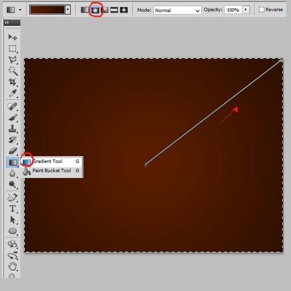
Choose first layer – Background. Pick gradient tool (G). Set Radial gradient from the top. Pick #591d00 and #2d0e00 colors.
Step 3
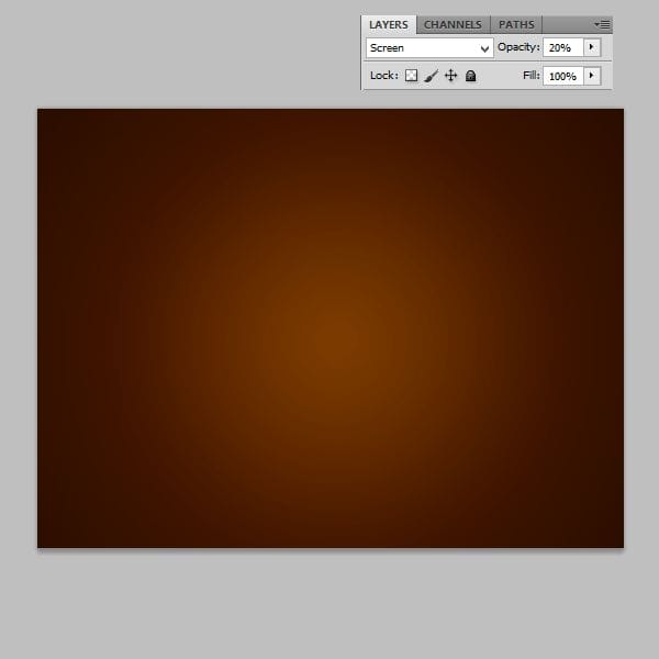
Add new layer (Shift + Ctrl + N or Layer > New > Layer…). Choose brush tool. Set #fea800 color. Pick Soft round brush and set it to 1242 px big. Draw dot on the center.

Step 4
Change blending mode of this layer to Screen and set opacity to 20%.
Step 5
Now you will need Bokeh stock. Place it into your image.

Step 6
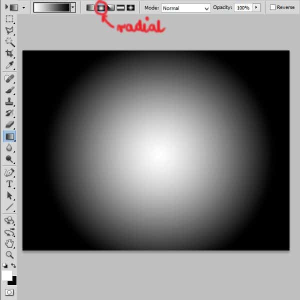
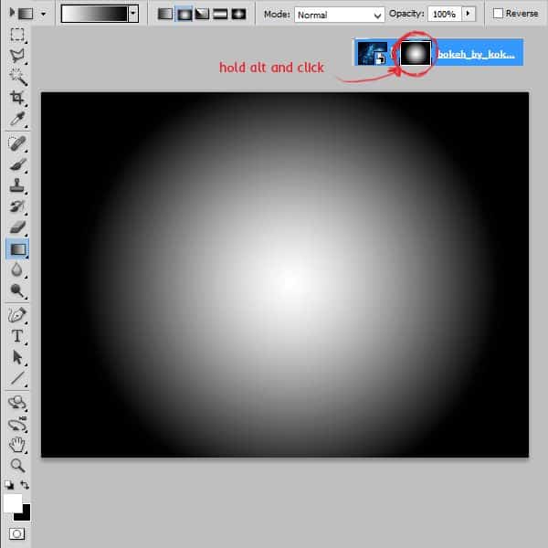
Click at the mask of the layer with holding alt. Choose black and white radial gradient and make something like that:
Step 7
Change blending mode of bokeh layer to Linear Dodge (Add).

Step 8
Create Adjustment layer with Hue/saturation (Layer > New Adjustment Layer > Hue/Saturation or use marked shortcut).
Hue: +175 Saturation: -100 Lightness: -76

Step 9
If Adjustment layer isn’t clippy (layer adjusts all below) you should make it clippy. Just click Right Mouse Button on Adjustment layer and choose from menu “Create clipping mask”.

Step 10
Add new layer (Shift + Ctrl + N or Layer > New > Layer…). Pick #612200 color and set linear gradient. Choose color – transparent one. Apply it by short line on the center.

Step 11
Change blending mode of this layer to Soft light and set opacity to 45%.

Step 12
Choose Type tool. Pick VAL font. Set size to 250 pt. Set color of type to #5b1e00.
Step 13
Add layer styles. Click RMB on layer and choose “Blending options”. Pick:
Inner shadow:
Blend Mode: Multiply, #000000, Opacity: 75%.

Inner glow:
Blend Mode: Screen, #612200, Opacity 5%.

Bevel and Emboss:
Style: Inner Bevel,
Technique: Smooth
Size: 6px,
Soften 0px
Highlight Mode: Screen, #fb9838, 75%
Shadow Mode: Multiply #2b0c03, 75%.
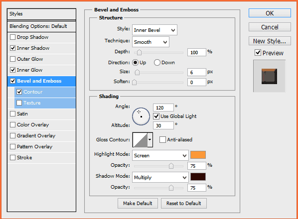
Contour:
50%

Step 14
Click where is shown to add layer mask. It works also on text layers :). With 24 px hard round brush erase some places, so it will looks like bitten.
18 responses to “How to Make Delicious Ice Cream Text in Photoshop”
-
Interesting Tutorial
-
Nice tutorial
-
This tutorial is incomplete.
-
Click on page 2
-
-
Nice tutorial . .so help ful
-
nice
-
where is bokeh stock
-
Thats a good turtorial
-
nice tutorial.. but all the steps r not visible… :/
-
cool & attractive
-
لطفا به صورت تصویری اموزش هارو بذارینl
-
Thanks for sharing such informative post its help me to know deeply Photoshop work step by step.
-
Nice but very tough
-
I can’t understand the correct position of various layers, because the layer panel screenshots don’t match the descriptions exposed in the tutorial. Could you kindly help me? Thank you very much!!
-
This applied to the lesson
http://i.imgur.com/kV10uuh.jpg-
So much #4. I actually had a cuometsr in my store today, printing his photos from Europe, lamenting a beer bottle sitting on a statue in a picture he really wanted to print. but then, I also couldn’t explain to this guy what aspect ratios were and why the picture he had edited into a square wouldn’t print properly onto a 4 6.
-
-
Thanks for the nice tutorial :)
-
nasike


Leave a Reply