Luminar AI lets you turn your ideas into reality with powerful, intelligent AI. Download the photo editor and see how you can completely transform your photos in a few clicks.
Typography is a remarkable piece of art that has its own styles and techniques to making a written language more appealing when it comes to learning and recognition. Today, you will witness inspiring examples of 3D Typography created by various talented artists. You will see in this article the process and tools they've used in creating a 3D inspiration. Have fun and enjoy!
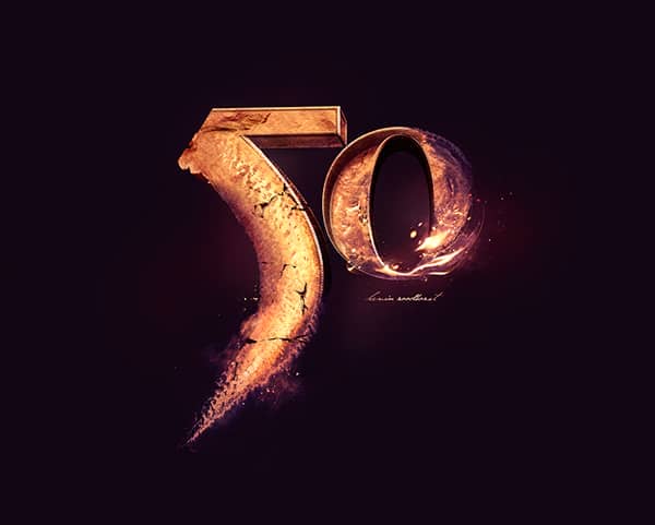
Kevin Roodhorst
"Nr.50 Typography is an experimental typography creation. I thought it would be great to somehow combine aquarelle paint with 3D type. First I created a base with aquarelle paint and scanned it into my pc. Then I made a couple of variations of 3D type and start blending them together. The Flames are also a combination of photoshop and cinema 4D. This is the result! Hope you like it.
Tools Used: Photoshop & Cinema 4D"
Mateus Orrico
"Picture 1 - Impact
I've always been very curious about 3D modeling, but never had time to study the specific software, so I decided to try with what I ruled: Photoshop and Illustrator. I also wanted to improve the quality more lights and shadows in mine and was this mixture that came these two parts. First I used Illustrator to generate letter by letter in 3D using the Extude tool. Worked with the color of the white letter and not much shifted in light, just enough to create a good contrast between the faces. After play was letter by letter in Photoshop and there give color to each of them and increase the contrast. After positioning and color each letter, I wondered where the light should come and started working in the shadows. I selected face by face and creating a mask it. In these masks, I was painting with a brush black soft areas that I thought should have shade and adjusting the opacity of these layers. I used 1-3 coats of black to try to get the most of a real shadow. After finalizing the shadows, did the same process with the areas that should be more enlightened, only this time by painting it white. Same process: masks and adjustment of opacity. At the end, I added some elements to give a little more life to the piece. IMPACT name was just a tribute to source I used (which has the same name) because it was one of the easiest sources that had found to work this technique.
Picture 2 - Foxine
This image was a gift I made for a college classmate (who is nicknamed Fox or Foxine) and the process was very similar to the previous one. As I mastered relatively well these effects, thought about going a step further and thought "Why not add real elements to 3D?". With that in mind, I chose the pictures of some foxes in positions that I thought were close the 3D. The secret was here working with lines that end faces and shadows. Use the shadows to merge 3D with real was the key for the part to stay nice and look as real as possible. Then only I used some bokeh effects to give a shine to the art."


Adam Nakiela
"I took a participate in the session of speedmodelling about creating 3D typo (on the forum of Newtek- producer of 3D software which I use - Lightwave 3D), made some project, and later- got this new idea to use millions of pins to form a 3D text. For this, I use instances feature from Lightwave 3D, where single block was multiplied to about 5 millions on the scene- creating a matrix of pins, their height was driven by some layers of textures, and similiar with color. For foreground- with similiar technique- i created crystal cubes. After rendering- I did some post-processing in Adobe Photoshop - color correction, depth of field using lens blur, etc."


Coen Pohl
"Don't look down:
For this project I wanted to practice more with unusual perspective points and 3D type. The result is skyline vista where you start looking at the horizon in the distance but slowly look down onto the street when moving your eyes down the illustration. The first step was to create a so called curvilinear perspective grid. This kind of perspective allows for multiple horizons and vanishing points. The effect is a bit like creating a vertical panorama with a camera when standing on a building. After that I made a rough layout of where the buildings and letters would come by drawing just the rooftops on the grid, followed by the walls, using the pen tool in illustrator. For the windows I first created an array of window shapes in Photoshop. Then I used the skew and distort functions in Photoshop to move the rows of windows into the right positions on the walls of the buildings.
Isometric Amsterdam:
The idea behind this project was to create a building pattern based on the typical Amsterdam canal houses. I'm fascinated by isometric designs and illustrations as it is a good way to create abstract endless cityscapes in all directions without having to worry about the issues with normal perspective drawings. Amsterdam canal houses often have roughly the same dimensions, so they are ideal to create a pattern with. The whole project was done in Adobe Illustrator CS5. All buildings have the same base shape, which was created by hand, using a simple isometric grid (there are plenty of them available for download on the internet). The smaller details and letters however, are created with the 3D tool found in Illustrator under the 'Effects' menu item. First I created the letters in 2D using a normal grid so that all letters would have the same look & feel. Then I used the 3D tool to instantly create isometric versions of these letters. I ungrouped the 3D objects into 2D shapes in order to have more control on the colours of each of the sides. I used the same technique to create some of the smaller details on the buildings like the stairs, roof decorations and windows."


Alexis Persani
"It's either some phrases taken at random, or so the song titles. For these 3D typography I used Cinema 4D software and photoshop."


Dan Hoopert
"The main concept was around colour, and creating some kind of physical form based on that. The work was heavily inspired by a similar project by Lee Griggs, brighter colours extrude elements further, creating the desired effect. I decided to have a go at my own take on this and see how it would work with letterforms rather than on a flat plane. The actual letters themselves are created using mainly Cinema 4D and Photoshop."


Alexandra Fomicheva
"Food text effect is created only with Adobe Photoshop Cs5 tools - 3D capabilities, layer style effects and simple preset patterns without using any photos, stock images or real food textures.
Some objects such as hot dogs, burgers/sandwich tops, pancakes and french fries are created with the "Repoussé" 3D option plus "Inflate sides" and "Band" shape presets. The green salad leaves and bacon texture are created with the "Mesh from Grayscale" option. This very useful and interesting tool. It helps to create relief surface by using the "grayscale" texture highlights for embossed areas and shadows for depths. Fried eggs, small details as sandwiches onion, tomatoes, cheese mayo, mustard and some other are created with the regular flat shapes and simple layer style effects. https://alfoart.com/food_text_


Marcus Byrne
"Smash This (Self initiated project to explore the ‘Explode’ tools in Cinema 4D.)
Created the text, extruded, then rotated each character slightly. Added the Explosion FX and played around with the object properties.
Textured with a reflective material and used a Sky Object to reflect in the text.
After various test renders, output with Channels and open in Photoshop.
Added final composition image layers with various overlays. The ‘Smoke image’ is set to screen mode to knock out the black.
Metal (Self initiated project to explore metallic reflections in Cinema 4D.)
Created a scene with Text, Floor base and Spheres. Worked out a basic composition that felt right. Textured with a reflective material and used various lights until I was happy. Textured the floor base with a Wood texture. Open in Photoshop for final composition grade.
Mega Pick (Commissioned 3D Type for Ladbrokes.)
The Type needed to feel huge, solid gold and heavy. The type lock up was created in Illustrator. In Cinema 4D, I created a scene, imported Type, extruded it, added a Floor base to catch shadows. Used a very wide Camera angle to give the illusion of looking up at this huge type. Worked out a basic composition that the client particularly wanted. Textured with a gold reflective material and used various lights to reflect in the material. Open in Photoshop for final composition grade."


Katlego Phatlane
"I was experimenting with 3D typography and those works were some of my first ever 3D type projects. They were for the sake of experimentation and getting to grips with the software. I used Autodesk 3Ds Max Adobe Illustrator and Photoshop. As I was experimenting I mostly came by them by accident, but most of them inspired future projects which you can find on my behance too."


Jeff Osborne
"I get my inspiration from different sources, the Bible ( I'm a born again Christian), sayings that I hear or see, or how I feel. I use a mixture of Cinema 4D, vRay, photoshop and illustrator. I start by draw the typography in illustrator, then I import the illustrated Typography into a Cinema 4D where I model and texture the typography , then use vRay to light the model, I then render the typography and place it into photoshop where I composite the typography with other textures and colour balance until I am happy."


Austeja Slavickaite
"To create 3D letters I used Xara 3D. This software, very basic one, allows you to create 3D typography, adjust lights, texture, colors but it's quite limited if you want to work with individual objects separately, not too many editing capabilities. So in the end I exported every letter individually and then put the composition together in Photoshop. While I was studying Graphic Design in Lithuania (Vilnius Academy of Arts) we were asked to make typographical compositions illustrating the chosen word and make it understandable even for someone who doesn't know the language trying to manipulate just fonts and characters although I added backgrounds later on. I decided to work with in 3D and I needed something really simple and easy to learn since time was limited, I wasn't bothered about the size of files too much, that's why Xara 3D was ok for me, there's a limit of font size, I think you cant work on fonts bigger than 72pt so wouldn't work for anything bigger than A3 for print, web is fine. So all of the illustrations are Lithuanian words meaning "MOON" "TOAD" and "PRINCE" ".


John Cathcart
"John Cathcart is a Digital Designer based in Belfast, Northern Ireland. Working from his studio, White Bear Design House he specialises in 3D modelling, lighting and texturing with over 15 years experience in the graphic design industry. You can see more of his work atwww.whitebeardesign.co.uk or check out his Behance portfolio at www.behance.net/
Layla
I created this piece using Maxon’s Cinema 4D and Adobe Photoshop CS6 for minor post-production adjustments. Utilising C4D’s Mograph and hair simulator to render the fur and grass allowed me to achieve a realistic result. The final piece was rendered to A1 and professionally printed and framed. The most challenging aspect of this piece was the fur and grass, I spent a lot of time adjusting the thickness, clump, twist and colour to get it to look just right and give it an almost fantasy, dream-like feel.
Note To Self: Don’t Die
This piece was inspired by a favourite musician of mine, Ryan Adams. I textured the text using various images and colours derived from some of his most famous songs. I nearly always begin a piece with the aim to output in large format which means putting a lot of pressure on my iMac but the end result more than makes up for it.
Harsh Reality
This is one of my most recent 3D typography pieces taken from the lyrics of Paolo Nutini’s song ‘Iron Sky’. Again, using Cinema 4D’s mograph tools I created the text and played around with the composition before texturing and lighting. The other artefacts within the piece were also modelled and textured from scratch. Texturing using high reflectance channels can really take it’s toll on the speed of your workflow so it’s always best to get the basics right long before you even think of hitting the render button."


Joshua Zaragoza
"First photo - Breakthrough
“Breakthrough” is another 3d typography experimentation. I made sure that the lights and glass texture will look realistic. I also used a plugin that breaks texts and a vine grower. Of course good post processing is needed in every artwork I make.
Second photo - Always have fun
I always love experimenting with 3d and textures. I first doodled the text and tried to put it up in 3d form. I added cheese curls, candy, and marshmallow textures to add the flavor.
Third photo - Surreal
My goal in every typography art I make is to achieve realistic form. “Surreal” artwork was created mostly by mixing textures, lights, stock photos and 3d elements.
Fb page: https://www.facebook.com/


Junjie Lim
"Each alphabet is executed through the support of a different element or medium to visually represent a word starting with the same alphabet. The main objective is for the viewer to know what word the alphabet represents without any supporting copy. The individual type posters started out as a rough sketch, and then they were moulded in Cinema 4d, followed by post edits on Photoshop."


6 comments on “Inspiring Examples of 3D Typography”
How hard is it to learn Cinema 4D?
Tahar photographe
Thanks for the inspiration. I really like these!
There are all very cool. I liked Coen Pohl the best though!
These are absolutely breathtaking! I must confess, "Don't Look Down" scares me a little bit. Would you try to create any of these?
Coen