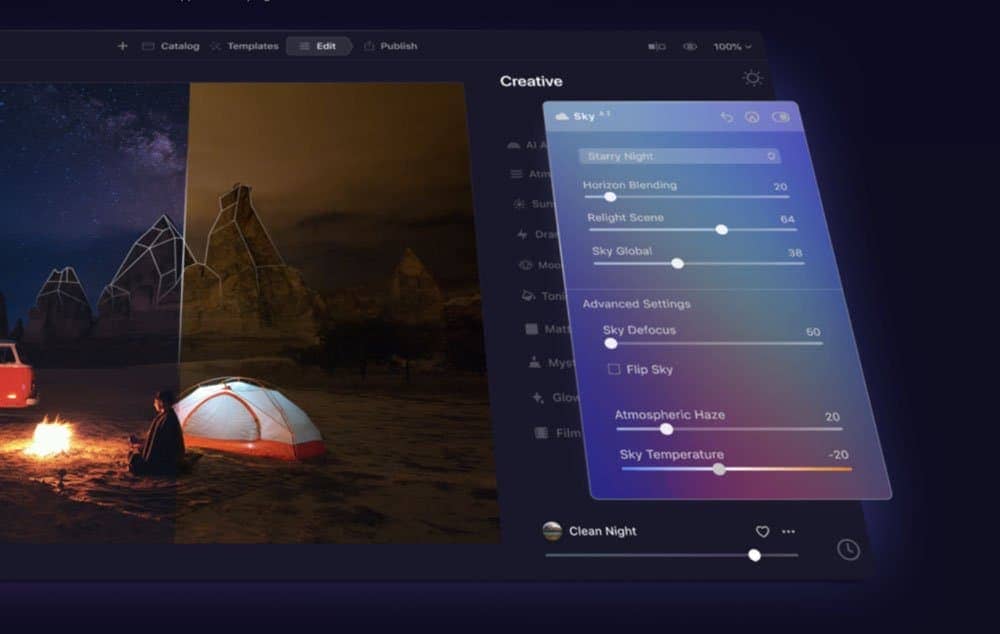
Luminar AI lets you turn your ideas into reality with powerful, intelligent AI. Download the photo editor and see how you can completely transform your photos in a few clicks.
![step-002b[6] step-002b[6]](https://cdn.photoshoptutorials.ws/images/stories/ddb09352d992_2F5/step-002b6.jpg?strip=all&lossy=1&quality=70&webp=70&avif=70&w=1920&ssl=1)
![step-002c[6] step-002c[6]](https://cdn.photoshoptutorials.ws/images/stories/ddb09352d992_2F5/step-002c6.jpg?strip=all&lossy=1&quality=70&webp=70&avif=70&w=1920&ssl=1)
![step-002d[6] step-002d[6]](https://cdn.photoshoptutorials.ws/images/stories/ddb09352d992_2F5/step-002d6.jpg?strip=all&lossy=1&quality=70&webp=70&avif=70&w=1920&ssl=1)
The second parameter is a joint point. It is my personal naming system so it could differ from what you have red in some drawing books or so. Anyway, it's not important, understanding the perspective plays here a main role. So if we will take a joint point under consideration... The very basic and easiest one is one-point perspective. And yes- it has only one point that is placed on the horizon line. Just imagine that you are in a huge cube and you are facing directly one of the inner walls. Vertical lines are parallel.
![step-002e[6] step-002e[6]](https://cdn.photoshoptutorials.ws/images/stories/ddb09352d992_2F5/step-002e6.jpg?strip=all&lossy=1&quality=70&webp=70&avif=70&w=1920&ssl=1)
![step-002f[6] step-002f[6]](https://cdn.photoshoptutorials.ws/images/stories/ddb09352d992_2F5/step-002f6.jpg?strip=all&lossy=1&quality=70&webp=70&avif=70&w=1920&ssl=1)
Now we can rotate our imaginary eyes in one axis so we will get two-point perspective. But still all vertical lines are parallel. The horizon line determines the level of our eyes. Don't fully connect the horizon line with a real horizon. We can look at the sky or even be in outer space and look on some planet. So the horizon line isn't perceptively determined, but our eyes are pointed in some direction. Ok, let's take a look at two-point perspective:
![step-002g[6] step-002g[6]](https://cdn.photoshoptutorials.ws/images/stories/ddb09352d992_2F5/step-002g6.jpg?strip=all&lossy=1&quality=70&webp=70&avif=70&w=1920&ssl=1)
Here every object have it's joint points. But it is not said that there's only two joint points on the scene. Every object makes two parallel lines and their joint point position depend on it's rotation in relation to other objects. For now I suppose you will know and understand how the three-point perspective stands.
![step-002h[6] step-002h[6]](https://cdn.photoshoptutorials.ws/images/stories/ddb09352d992_2F5/step-002h6.jpg?strip=all&lossy=1&quality=70&webp=70&avif=70&w=1920&ssl=1)
There are more complicated structures like five-point (so called hemispherical) or even six-point perspective (when we draw a 360 degree view) which is super hard to achieve and this is truly subject for advanced painters. Let's stick to the first two we learned about.
Step 3 - Sketching
I'm kind of old-school guy and before I will do anything in Photoshop I always try to make some sketches on paper. Try for yourself even if you are not pro drawers. Actually it doesn't matter- you just want to make a plan. It's like an escape from prison. Sorry for example, but if something had to be perfect, you had to have a solid plan where you considered a lot of options and choose best. Fly thru the colors in your head. Imagine how things could look like. It's not about details- we will take care of them in design process. It's about an idea. By the way- I'm not a big fan of grid systems. They came and now most of web layouts look the same. For me designing is not about placing boxes around that sticks to the lines. It's about composition, user experience when he see the website first time, usability and (the aspect killed by grid systems) originality. I'm not saying they are bad, they're just overused. So, next time when you will try to design some piece of web layout- craft a sketch.


2 comments on “Complete Guide to Creating a Blog Website Layout”
awesome post!
thanks for sharing..
Dzięki za tutka. Muszę przyznać że fajnie wygląda ale przy 8 latach doświadczenia wszystko można zrobić :)
BTW:
Czemu mnie nie dziwi że w komentarzach pojawia się flame ? ;d