Step 6
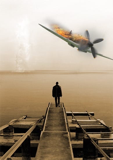
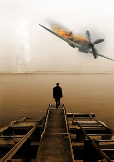
Now change the blend mode of the plane layer to multiply, if you followed the previous tutorial you may have already done this.

Step 7
Change the foreground color to black then select the gradient tool then click the drop down arrow in the main toolbar and select the second gradient which should go from transparent to opaque black, if not then just make a custom gradient like this. Make sure the gradient type is set at linear then hold Shift and drag from the bottom of the document up to about the middle of the wing and you should get something like the image below.

Step 8
Change the blend mode of this layer to soft light.

Step 9
Duplicate this layer and change the opacity to 75% and the blend mode to multiply. We did it in this way so we can have the image fade to black at the bottom but still preserve the color saturation of the image; this is a good one to remember. We darkened the bottom of the image for two reasons; firstly to draw the focus away from the dock which stood out too much and secondly so we place our text here and it will stand out.

{articlead}
Step 10
We’re going to go for a really cliche movie font, Trajan; used on more than half of all movie posters since 2000. Trajan is overused but we’re going to use it here because we’re not aiming for originality anyway. Select the type tool then click somewhere in the document then type ‘the’ and change the size to 40pt, the font to Trajan/Trajan Pro and the color to white. Now move the text to just below the guy like in the image below.

Step 11
Now select the type tool again and click in the document then type ‘PlanE’ (note the uppercase/lowercase characters) and change the size to 180pt, I also changed the size of the ‘E’ to 170pt as it looked to big. The last thing that you need to do is to change the tracking (horizontal character spacing) of some of the letters to even it out. DO this by going Window>Character and highlighting one letter at a time and changing the tracking until it looks balanced and ‘symmetrical’. Now move it to where it looks good.
13 responses to “How to Create a Movie Quality DVD Cover”
-
Alan Okrzos no.1 in poland!
-
alan
-
-
Nice
-
this is such an awesome tutorial
-
wow I made a dope movie called somethingsomething and this is all I needed
-
What the font for the actors name
-
Thank you!
-
np bruv
-
-
nice
-
Thats good
-
Oh my gosh! This helped me a lot! I was going to make a storie with Justin Bieber ( no hate ) And this is all I needed! Very grateful!
-
“Johnny Deppp”
-
I love my DVD Cover


Leave a Reply