Learn how to create this amazing typographic illustration with colorful type treatment. In this tutorial, Edmar Cisneros will show you how to create this artwork using Photoshop layer styles and special lighting effects.
Preview of Final Results

Resources
- Tetra Font – Font fabric
- Bokeh Textures– Photoshop Tutorials
Step 1
Create a new document on Photoshop. It should be 2100 pixels wide and 3300 pixels high with a resolution of 300 dpi. Using the bucket tool (G) Fill the background layer with black.

Go to the Type Tool (T) and select the Tetra Font with a size of about 250 pt (you can do it larger if you want) and type the word “Super”on the upper part of the canvas. I chose the Tetra font because of its shapes but you can use any font you like.

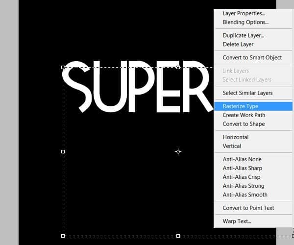
Right-click on the layer text of the type and select “Rasterize layer” to make it editable.

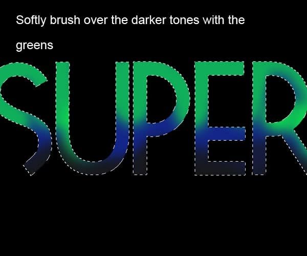
Create a new layer. Select the type shape (Ctrl+click on the layer thumbnail) and grab the Brush tool (B). We are going to paint over the selection on the new layer to get the colors for the type. First start with the middle tone of the color palette you want to use. In this case, for the first word I chose a combination of dark blues going all the way to bright greens.

Fill the selection with the blue color. Select a soft brush 0% hardness of about 250 pixels and brush over the lower part of the type with the darker blue to create some shading.


Change the size of the brush to something about 150pxl and select the darkest green color and start painting the lighter parts on the top of the letters. Be sure to leave some traces of the blue underneath the greener tones. You can also lower the opacity of the brush to about 40% to blend in the colors smoothly.

Continue this way with the lighter green tones. Make sure you keep little hints of the color under the brighter shades and blend in the colors with your soft brush.


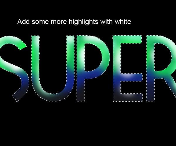
Now using color white and a smaller brush, add some more highlights to the lighter part of the letters.

Once you are confortable with the result, you can go to Image>Adjustments>Brightness and contrast to make the colors pop a bit more:
34 responses to “How to Create Shiny Retro Text with Photoshop”
-
NO PUEDO HACER NADA CON EL TEXTO NO DEJA CAMBIAR NADA NO CON LOS PSD QUE REGALA QUIERO PONER UN NOMBRE Y NO DEJA COMO LO AGO GRACIAS
-
DOPE
-
fantastic tutorial..like it very much..
-
I always believe typography is great art and thanks for this awesome experiment on it.
-
Please help! Im stuck doing the pen tool, it doesnt work as i want it to do. I can only se the paths but no color, how do i fix it? i have tried anything i can come up with.. Its sad being stuck when i have done so much already. Thx!
-
Thanks a lot.Plz describe more……………///
-
I’m on Photoshop CC 2014 and I cannot for the life of me get the same effect that Step 2 is telling me I should be getting. Any advice?
-
wow ….all Photoshop Tutorials are very nice …….
-
Most instructions were not given clearly, pen tool behaved in a very different way from what you barely explained, and the font you are using called “Tetra” is not in photoshop CS6 or CC.
-
Don’t know if it’s an actual problem or if i’m just doing something wrong, but I can’t figure out how to warp the light effects.
The program swears that there aren’t any pixels in the selection, and by the time i finally get the selection to warp, it doesn’t warp the glow of the light effect so there’s just an eclipse shadow left behind.Help?
-
Muy bueno Man!!..gracias por compartir y éxitos en tu oficio!
-
very nice work
-
really superb………
-
nice wonderful transliterate word
-
Final result looks really cool, lots of steps to do, but I wanna try this for sure! Thanks a lot for the tutorial! :D
-
are u a girl
-
-
Step 4 does not work for me? I have tried everything, does somebody know what the reason behind this could be?
-
Here’s a video to show how to do step 4
http://www.youtube.com/watch?v=T0LQKqykO2A
-
-
not good instructions for the lines on page 2, for on i can’t make them with this pen pressure crap, or even warp the lines correctly
-
panjang bener,,,tapi ok ,,thank ya gan,.
-
I ALWAYS HAVE A PROBLEM CONTROLLING MY PEN NEVER ENDS UP WHERE I WANT IT …SO I JUST DOWNLOADED SOME WAVE LINE BRUSHES TO SUBSTITUTE THAT PART OF THE TUTORIAL…THIS IS THE WEBSITE THERE ARE MANY WONDERFUL BRUSHES…..http://www.photoshopedia.com/photoshop/brushes/
-
@eva908 this website needs a user name and password to open!!!!!!!!
-
-
Very nice
-
for the life of me my pen line wouldnt do what you wanted it to do! argh!
-
Yes! Same problem!
-
Me too! Eh, sucks… Trying to figure out how to do it on my own..
-
Fantastic Photoshop and informative tools ..
Thanks to share…….
That is nice post and thanks to share……..
page 2 and 3 can’t open ?
very nice tutorials
Woooww… Its Cool :0
very good .. thanx
amazing,… super
-
good yaar


Leave a Reply to Jasy FriendCancel reply