Make skin look perfect in one-click with these AI-powered Photoshop actions.
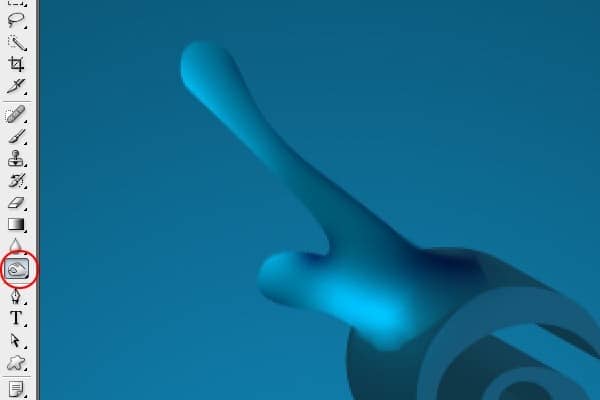
Step 11 - Adding More Highlights
In this step you´ll add highlights to the upper part of the splash. Select the Pen Tool (P) and create a path as you can see on the image bellow.
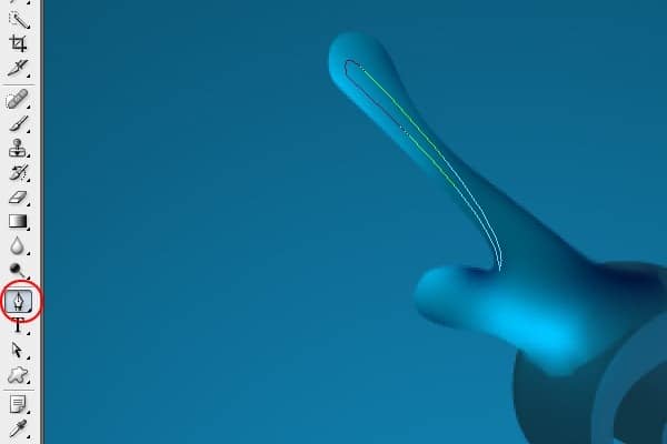
Step 12 - Filling The Path With Color
Fill the path with white color. To do that press Ctrl + Enter to make selection of the path, grab the Gradient Tool (G) and fill the shape with solid white color.

Step 13 - Lower The Opacity
It´s necessary to reduce the brightness of the fill. To do that reduce the opacity to 20%. To make the gloss more realistic add some blur. Go to Menu > Filter > Blur > Gaussian Blur and set the value Radius on 0.8px.

Step 14 - Adding More Highlights
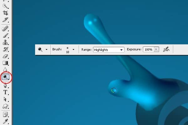
In this step you're going to add even more highlights to the shape to get a liquid feel. Select the Dodge Tool (O) and dodge the areas similarly as it´s shown in the image below.
Step 15 - Changing Color
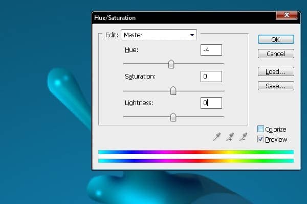
To create bit more 3D feel you need to fade the color a little. Go to Image > Adjustments > Hue/Saturation (or press Ctrl + U) and set the value Hue on -4.
Step 16 - Blending the Shape
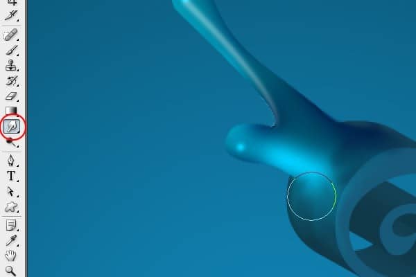
The shape should be blended with the text more properly to it will look like the text is really splashing. To do that select the Smudge Tool (R) from the tools and drag the edges of the shape to fit the text. Look at the image bellow to see exactly what I mean.
Step 17 - Adding Shadow
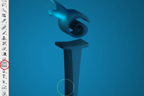
To get more depth it´s necessary to add more shadows to the object.
Grab the Burn Tool (O) from tools and paint over the areas which you want to make darker. Bellow you can see how your image should look so far.
Step 18 - Adding Highlights
Once you´re done with the shadows you need to add some highlights to the other site of the text. To do that select the Dodge Tool (O) from tools and paint highlights as it´s shown bellow.
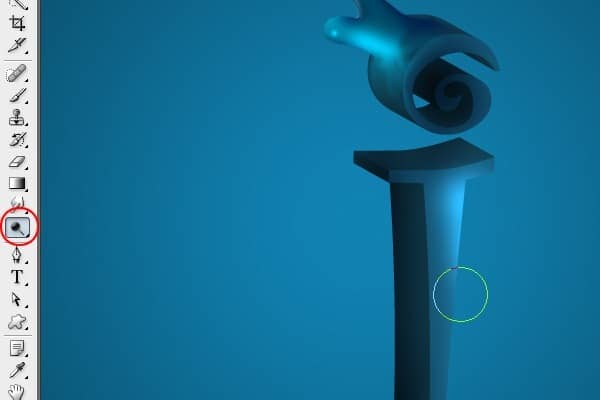
Your manipulation should look like the one bellow.

Step 19 - Separating the Dot
In this step you´'re going to separate the dot from the rest of the image. It´s necessary because in next steps you will make adjustments only on this part. Grab the Marquee Tool (M) and make selection as you see in the image below. Cut and paste the area and name the layer " DOT" to identify it simply.

Step 20 - Adding Colors To The Dot
It´s time to add some colors to the dot. To do that select Rectangle Marquee Tool (M) and create a selection as you see in the image below. Create a new layer and fill the area with green (#98b209). Then select similar area on the right side and fill it with pink (#ea185f) and one more which should be filled with blue (#0048ff). You can see the whole process in the images bellow. Press Ctrl + T and rotate the shape 50 degrees.

