Make skin look perfect in one-click with these AI-powered Photoshop actions.
Learn how to create this wallpaper in Photoshop using 3D text from Illustrator and custom shapes and Photoshop brushes. You’ll learn how to place shadows under objects, create a focus point using repetition, and more.
Preview of Final Result

Rainbow Text Wallpaper Photoshop Tutorial
Step 1 - Create A New Document
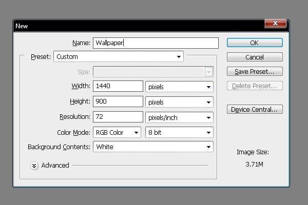
Choose File > New or press Ctrl/Command + N. The size of my wallpaper is 1440px (width) X 900px (height) but you can use any size you wish.
Step 2 - Filling the Background
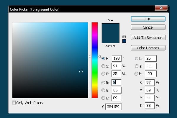
Grab the Gradient Tool, pick #084159 blue color and fill the background.
Step 3 - Placing Spot Light
Now you're going to add a spot light to the background. This effect creates focus on the main object. Select the Brush Tool (B) and choose the soft round brush. Set the Diameter on 300px. Pick some lighter blue color and paint a dot in the middle of the background. Result of this step can be seen bellow.

Step 4 - Creating 3D Text
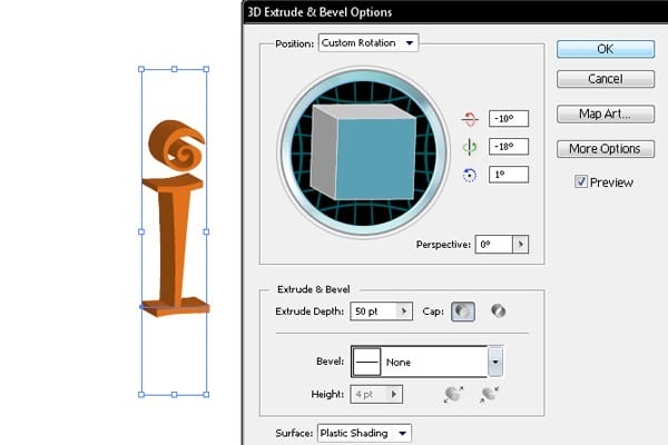
In this step you´ll create 3D text. To do that open Illustrator and follow the instructions bellow. Grab the Type Tool, select font Curlz MT (you can download it here) and type the letter "i". Change color of the letter on orange (#F57F20). Go to Menu > Effect > 3D > Extrude & Bevel. Follow the setting below.
Step 5 - Placing 3D Text in Photoshop
Copy the text from Illustrator and paste it to Photoshop. Select this new layer, right click on it and choose Rasterize Layer.

Step 6 - Changing Colors
In this step you're going to change the text color to match with the background. You could change the color directly in Illustrator but you need to match the background color and the color of the letter. That is the reason to change it in Photoshop.

Step 7 - Creating Splash Effect
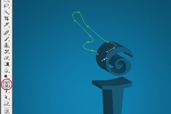
To add splash effect select the Pen Tool (P) and create a path similar to the one bellow.
Step 8 - Adding Color Fill To The Path
Once you´ve created the path, press Ctrl + Enter to make selection of it. Grab the Gradient Tool (G) and fill it with solid #005A75 light blue color.

Step 9 - Adding Highlights
In this step you´ll add highlights to the shape. This effect creates glossy feel. Select the Dodge Tool (O) and highlight some areas similar as shown in the image bellow.

Step 10 -Adding Shadows
Once you´re done with the highlights you need to create shadows on the opposite side of the shape. Select the Burn Tool (O) and paint over the areas which should be darker.

Step 11 - Adding More Highlights
In this step you´ll add highlights to the upper part of the splash. Select the Pen Tool (P) and create a path as you can see on the image bellow.

Step 12 - Filling The Path With Color
Fill the path with white color. To do that press Ctrl + Enter to make selection of the path, grab the Gradient Tool (G) and fill the shape with solid white color.

Step 13 - Lower The Opacity
It´s necessary to reduce the brightness of the fill. To do that reduce the opacity to 20%. To make the gloss more realistic add some blur. Go to Menu > Filter > Blur > Gaussian Blur and set the value Radius on 0.8px.

Step 14 - Adding More Highlights
In this step you're going to add even more highlights to the shape to get a liquid feel. Select the Dodge Tool (O) and dodge the areas similarly as it´s shown in the image below.

Step 15 - Changing Color
To create bit more 3D feel you need to fade the color a little. Go to Image > Adjustments > Hue/Saturation (or press Ctrl + U) and set the value Hue on -4.

Step 16 - Blending the Shape
The shape should be blended with the text more properly to it will look like the text is really splashing. To do that select the Smudge Tool (R) from the tools and drag the edges of the shape to fit the text. Look at the image bellow to see exactly what I mean.

Step 17 - Adding Shadow
To get more depth it´s necessary to add more shadows to the object.
Grab the Burn Tool (O) from tools and paint over the areas which you want to make darker. Bellow you can see how your image should look so far.

Step 18 - Adding Highlights
Once you´re done with the shadows you need to add some highlights to the other site of the text. To do that select the Dodge Tool (O) from tools and paint highlights as it´s shown bellow.

Your manipulation should look like the one bellow.

Step 19 - Separating the Dot
In this step you´'re going to separate the dot from the rest of the image. It´s necessary because in next steps you will make adjustments only on this part. Grab the Marquee Tool (M) and make selection as you see in the image below. Cut and paste the area and name the layer " DOT" to identify it simply.

Step 20 - Adding Colors To The Dot
It´s time to add some colors to the dot. To do that select Rectangle Marquee Tool (M) and create a selection as you see in the image below. Create a new layer and fill the area with green (#98b209). Then select similar area on the right side and fill it with pink (#ea185f) and one more which should be filled with blue (#0048ff). You can see the whole process in the images bellow. Press Ctrl + T and rotate the shape 50 degrees.


Step 21 - Adding Motion Blur
Add motion blur to the shape to make the corners of the shape smooth. Select Menu > Filter > Blur > Motion Blur and set the same setting as on the picture bellow.

Step 22 - Adding Gaussian Blur
To make the edges even smoother you need to add Gaussian Blur. Select Menu > Filter > Blur > Gaussian Blur and set Radius on 32.7 px.

Step 23 - Blending Color With The Background
Place the colorful layer above the splash object and change Blending Mode on Hue. Now press Ctrl + Alt + G to group the layer inside the shape.

Step 24 - Adding Colors To The Dot
You want to make colorful only the dot but not the rest of the letter. Place the colorful layer above the "DOT" layer. Right click on the layer and select Create Clipping Mask. This way the colors will be visible only on the dot.

Step 25 - Adding Colors To Body Of The Text
In this step you´re going to add color also to the body of the letter. Duplicate the layer with color and place it above the body of the letter. Change the Blending Mode to Hue again. Press Ctrl + Alt + G to group the layer inside the shape and then press Ctrl + T to expand the size.

Step 26 - Moving The Colors
To make the colors properly fitting grab the Move Tool (V) and move the colorful layers up and down to fit them with the letter. Below you can see how your image should look so far.

Step 27 - Creating Shadow Under the Letter
Duplicate the letter. Press Ctrl + T to make a free transform and transform it as you can see on the picture bellow. Then grab the Gradient Tool (G) and fill the shape with solid black color.


Step 28 - Adding Blur
To make the shadow more realistic it´s necessary to blur it. Select Menu > Filter > Blur > Gaussian Blur and set the value Radius on 4 px. Press OK.

Step 29 - Fading The Shadow
The shadow should be less visible on the opposite site. To fix that select the Eraser Tool (E). Select some soft round brush and set the value Master Diameter on 300 px. Erase the top part of the shadow.

Step 30 - Warping The Shadow
In this step you´ll warp the shadow to make it even more realistic.
Go to Edit > Transform > Warp and move with the grid as you can see on the picture bellow. Once you´re satisfied with the shape press Enter.

Your picture should look like the one bellow so far.

Step 31 - Duplicating The Object
In this step you are going to add more of the letters to create perspective. To do that duplicate the letter without colors several times and place these new letters similar as in the picture bellow.

Step 32 - Creating A Camera Effect
Once you´ve placed all the objects, you're going to add blur to all the objects to create camera focus. Select Menu > Filter > Blur > Gaussian Blur and set the diameter as it´s shown on the pictures bellow.


Step 33 - Adding Clouds
In this step you´re going to add some clouds behind the text. Download the cloud brush from this link and install it into Photoshop. Once you´re done grab the Brush Tool (B) and select one of the cloud brushes you´ve just installed.

Pick some light blue color and paint the clouds similarly as on the picture bellow.

Step 34 - Placing The Bird
Select Custom Shape Tool (U) from tools. Choose the parrot shape and place it above the text. (You can download similar bird shape here)

Your picture should look like the one bellow.

Step 35 - Placing The Feathers
Download the feather brush and install it into Photoshop.

Paint some random black feathers as you can see bellow. Change rotation of some feather by selecting them with Marque Tool (M) and rotating them after pressing Ctrl + T. You can also warp them a little with use of Warp Tool (Edit > Transform > Warp).

Step 36 - Adding Shadow Under The Bird
The last thing which is necessary to do is to place shadow under the bird. Make a selection as you see in the image below and fill it with black. Lower the opacity of this layer to 70%.

Final Result