Step 14

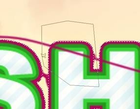
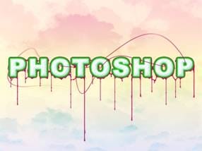
Try adding some more lines using the same method shown in the last three steps. Try also changing the brush size to either 2px or 1px or switching on simulate pressure.
In this example I used a 1px brush with simulate pressure on.
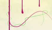
Here I used our green swatch, again with 1px and simulate pressure on.

For this effect I used a 2px brush with simulate pressure on and when creating the path, held Shift to get a straight line.
Step 15

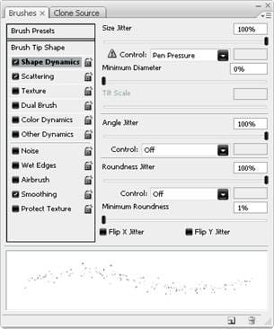
A quick way to make some random dots is to first select the brush tool, using a 2px hard brush then hit F5 to open the brush editor. Use the same settings as shown here and use the blue swatch we created earlier. For this brush we can drag it, note how the dots will be random and will give different effects depending on how fast you move the cursor.

Step 16
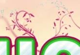
For this step you will need to have a floral brush set, lots of these can be found here, download one and install it, note that you may need to restart Photoshop after installing it. Create a new group behind the text and in a new layer; use the purple swatch and go wild with these brushes, making them flow from the letters and the lines. My set included some leaves which I dotted around using the green swatch. Using the floral brushes was just an idea, other vector style brushes can give good results too, one which is worth trying is using tree brushes on the top half of the letters.

Step 17

Another nice detail that is simple to make is these blue lines. First create a new layer then select the blue swatch then the brush tool and use an 8px hard brush. Use the pen tool to create a large arc, mine went roughly from the ‘H’ to the ‘O’, now stroke the path and make sure simulate pressure is checked. Use the eraser tool to get rid of half of the line and to blend it slightly. I created three of these.
Step 18
Duplicate this layer, with all three lines in it then hit Ctrl+T and rotate the lines roughly 180° then move them to below the text as shown here.

Step 19

The text is looking nice now however the foreground and background are like to separate images at the moment so we will learn a few ways to make them harmonize better. A good way to approach this problem would be to create an in between layer which is kind of half and half and can bridge the gap between foreground and background. Start by creating a new group within the foreground group but below everything else in that group. Create a new layer in this group then go image>apply image then edit>transform>warp and drag only the boxes here to warp the image, make sure that when your warping the image it still covers the entire document or else you will be left with sharp edges.
11 responses to “Decorating Text”
-
Very nice art work. My path was not so smooth, need more practice. I could hide some imperfections in color mode:-). My pattern creation was not cool, either. TU so much for sharing.
-
Still The First Step to Create Pattern was confusing. What you mean by use polygon tool and make the first image. We didn’t get. Anyone one can help? What it really means?
-
i don’t understand the first step, could someone please elaborate? :)
thanks-
I got a little confused there too. What you do is create a new layer, hide the background by clicking the eye looking button on the left of it, click your color square at the bottomish left and put in the hex code number #808080 if you dont know what that is, it is the bottom middle option when you click the color square. Then just set layer 1 to that color. Next you use the polygonal lasso tool to recreate the first image that was shown. So just use the lasso tool to select parts to delete to RECREATE the FIRST image shown. Hope I helped!
-
-
CULO
-
awesome !!
-
great shareing i love it
-
how do you add the things coming off of the letters?
-
I love it ;P no i hate it f off
-
Bet you can do a lot better
-
-
Awesome! Great Tutorial. I did it with my name :)


Leave a Reply