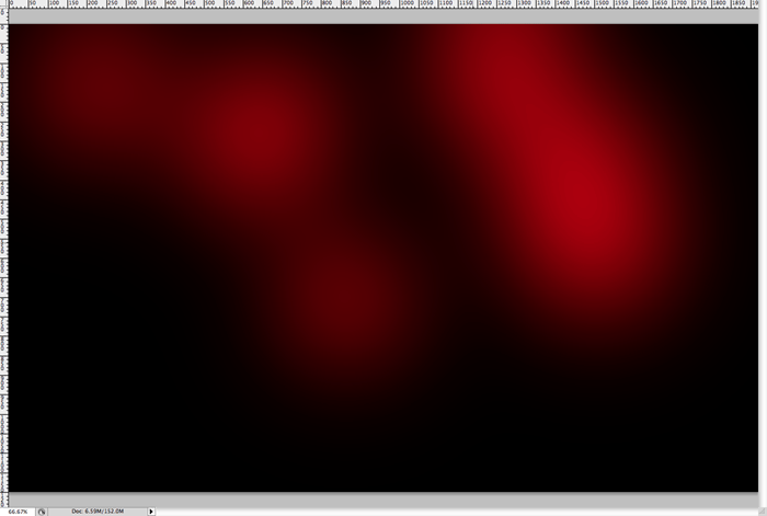
Step 18
Now that the highlighting from the “Add” layer has been taken down a peg, you should see something like this. With bits and pieces of highlighting here and there. We want something kinda random so it looks like it’s shiny and reflecting light. The shininess is a typical retro style effect.
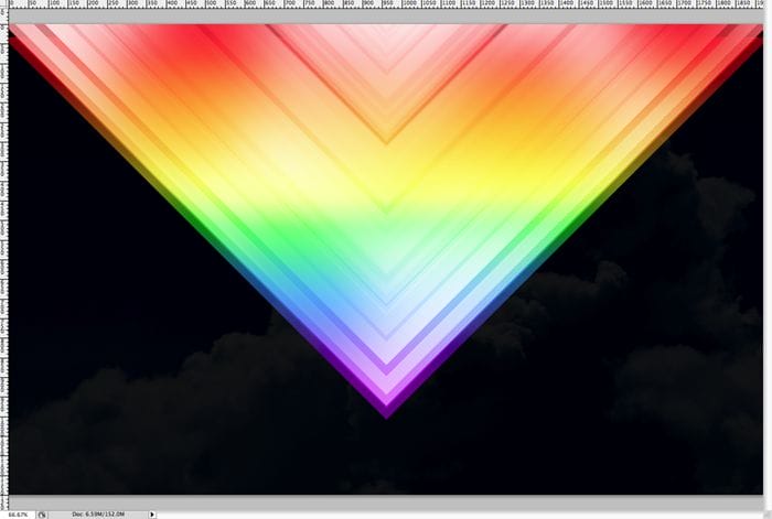
Step 19
Duplicate the “Add” V-shape layer and set it’s blending mode to “Overlay”. Now invert the color from white to black. We’re starting to give the shape a color contrast in the shadows now instead of the highlights.

Step 20
Duplicate the top “V” layer once more and set the blending mode to “normal”. Then set the opacity down to 50% or so.
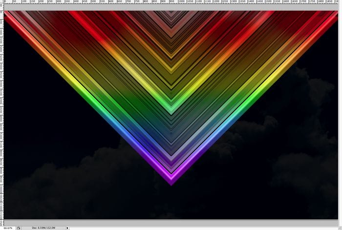
Step 21
Duplicate the top layer once more keeping the blending mode at “normal” and set the opacity at 100%. Don’t be alarmed if a lot of the image has been blacked out at this point, we’ll bring back some of it in the next steps. BUT: if it is completely black right now, we have problems, you’ll need to play with your black “V” shape layers so that you see some color “V” layers underneath them.
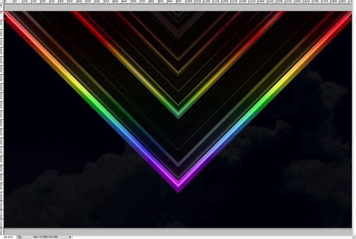
Step 22
Now it’s time for the lens flares… another trademark look of the retro style. Create a new layer on top of everything else, and fill it completely with black. Then take your lens flare brush and get it to an appropriate size and place a lens flare on the canvas where it will be overtop of the “V” shape. You only want to be placing flares on your shape, but you’ll be able to move them around later.

Step 23
Now create a new layer and taking your marque tool, select a rectangular area on the top or bottom half (it doesn’t matter which) of your flare. We’re going to make a flare “burst”.
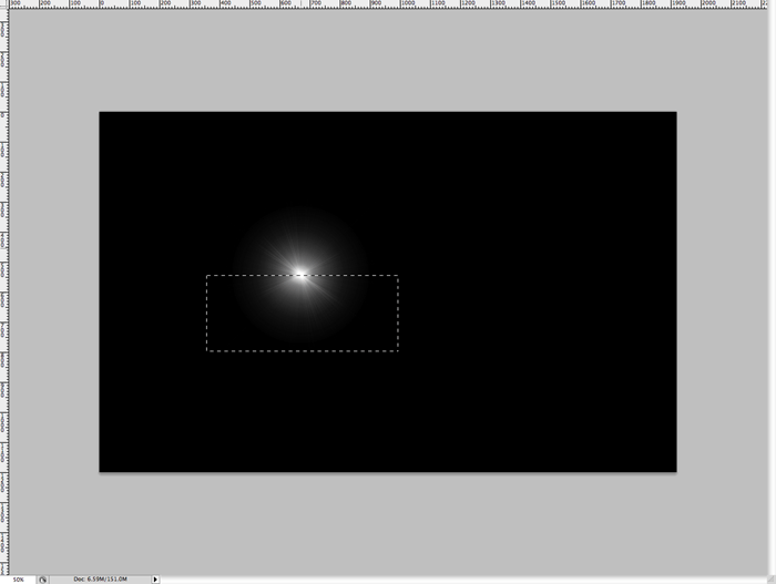
Step 24
Taking a large soft brush, but not too large that it’s bigger than your rectangular selection, create a white half circle like so.

Step 25
Now it ctrl/cmd + T and rotate the flare “burst” to -45% or whatever looks good to you.
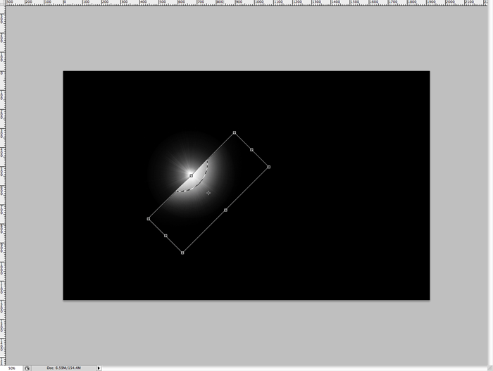
Step 26
Merge the lens flare layer with the flare “burst” layer. It shouldn’t change the look, but it will make it one object that you can move around and adjust later.
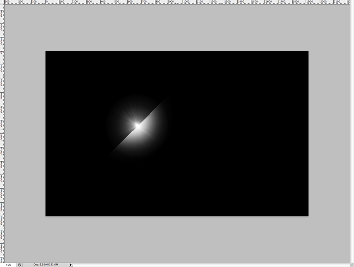
Step 27
Then set the blending mode to “Linear Dodge” or “Add” mode. You should see that the light looks very intense and shiny which is exactly what we’re going for.
39 responses to “How to Create a Colorful Retro Poster in Easy Steps”
-
step 9 isn’t clear to me how to cut out that half piece from that shape???
-
Great tutorial!
-
your instructions are awful and unclear every single step is a nightmare to complete.
-
I got lost pretty much step 8 then i tried to follow until step 16 then gave up as you make it quite complicated.
“Duplicate the top layer that you just put in screen mode. Remove the layer styles, we just want it to be white. Now set the layer blending mode to “Linear Dodge” or “Add”. Now you should see major highlights like below.”
At what point did you change a blend mode to screen mode on one of the layers? I didn’t see any step for that.
The tutorial may be ok for regular users but for novices, it’s just confusing. -
DON’T TRY THIS TUTORIAL. SPENT TOO MUCH TIME BEFORE GETTING STUCK ON STEPS 19/20. THERE IS A MISSING STEP OR ERROR AND THE PSD DOWNLOAD LINK IS BROKEN!!!!!!!!!!!!!!!!!!!!!!!
-
Its hard to follow.
-
wow ,its nice post.
-
it’s a great work,thanks for sharing………………
-
wow this sucks why
-
Sir I am unable to understand the step no 20 as after invert the color from white the black the result is quietly different so plz help me.
-
On step 9 I masked it and it did not create a triangle I do not know how you got to step 10
-
how do you invert colours from white to black in step 19?
-
Press Ctrl/Cmd+I
-
-
This is hard!
-
the instruction are really confusing , how many layers are we making, mine pic doesn’t even look like your’s
-
wow very nice.
THANK YOU ! -
I don’t understand step 16 ._.
-
Select the top layer then duplicate it by pressing Ctrl/Cmd+J. Remove the layer styles by going to Layer > Layer Style > Clear Layer Styles. Now, in the Layers panel, change the blending mode to “Linear Dodge” or “Add”. Hope this helps!
-
-
Hey nice tutorial, and nice retro effect!
This is what i do following your tutorial. And adding some other complements.
http://prototype-da.deviantart.com/art/ArcHon-Retro-Lines-403478125?ga_submit_new=10%253A1380338295 -
my layer doesn’t look like yours in step 12. I don’t know why.
-
Sadly you totally lost me at 21.
-
Step 21 is simply a repeat of step 20. You just duplicate that top layer one more time and then change the opacity from 50% to 100%.
-
-
yo whadup your thang worked greaaat pardner.aye the feirce wind gods blow and wail outside yonder window
-
First of all, thank you very for this tutorial. With the help of this, our presentation looks more shiny. Thank you.
-
This is wow but need more knowledge on forming layers
thx -
i did this work in photoshop CS but it did’nt work completely. very hard because i could’nt group it neither turn it to 40 degree or delete it…..so hard
-
Wow!
-
Which layer do you duplicate on step 20? The one with the “Linear Dodge” blending mode, the one with the mask or the one with the inverted mask colors?
i duplicate the layer in which we inverted the colors (step 19), but i, on step 21, get a completely different result than you do.
Any help please?
-
On step 20 you should be duplicating your top layer
-
-
It’s Superb! <3 Loved It :)
Here is My Result :
-
you know i cant do that
-
-
i cant understand step 9 -.-
-
Excellentay
-
Thx!! easy and nice
Author is good -
GOOD
-
Too complicated procedure to create Colorful Retro Poster, actually it was confounding way to make it sans instances.
-
mmmmmmmmmm
-
pls mention the tools too
-
-
Beautiful <3


Leave a Reply