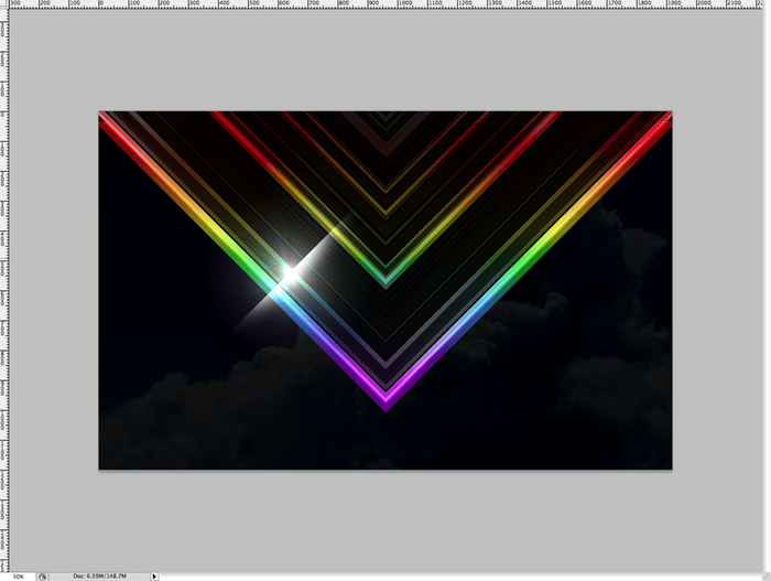
Step 28
Now you get to duplicate the flare layer as many times as necessary to get a good number of flares over your shape. I resized certain flares here and there so they look slightly random and unique. Once you’re done with that, group all the flares layers so you can keep track of them if you’d like.

Step 29
Open up your paper layer and select a good portion that you want to use. This will serve as a vintage texture, and you can get creative by finding other images with an “old” look to them like scratches or grungy textures.
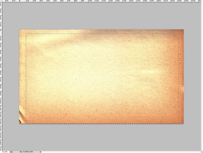
Step 30
Paste the selected portion at the top of your document and take a lot of the saturation out of it. We aren’t using this layer primarily for color really, but a slight tan/yellow/orangy color is nice for retro since it makes things look old.
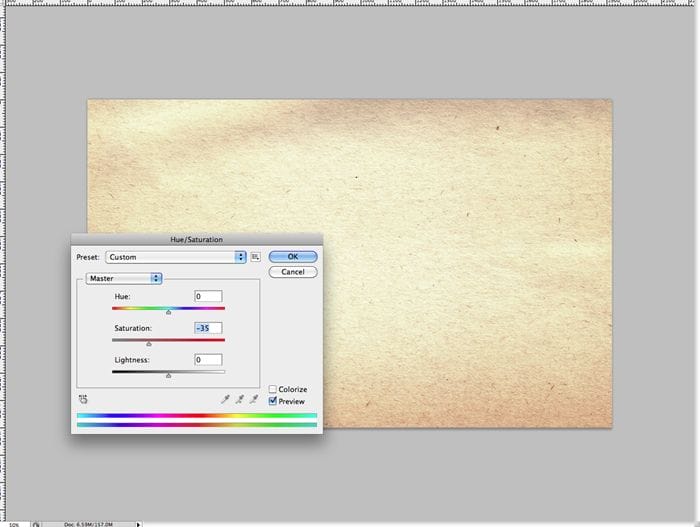
Step 31
Set the blending mode of your texture layer to “soft light” and set the opacity down a bit to 75% or so.
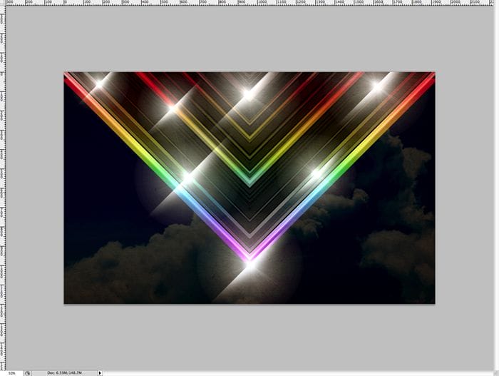
Step 32
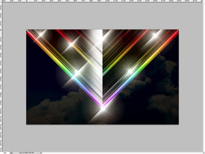
Now select your “V” shape in it’s entirety. This may involve you holding down ctrl/cmd or shift and selecting all your “V” layers.

Step 33
Now holding the option key, subtract half of your selection. Now you should only have one half of your “V” shape highlighted.

Step 34
Create a white to transparent gradient and make a short gradient off to the side that you’ve selected.
Step 35
Set the layer’s blending mode to “soft light” and bump down the opacity to around 75% or so.

Step 36
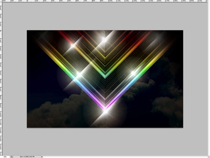
Create a new layer on the top, and using a large soft brush and the color black, paint over the upper corners of the “V”. You can use a gaussian blur if necessary to make them look right, but depending on the brush size you use you may or may not have to do this.
Step 37
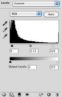
Create a new layer adjustment for “levels” at the top of your document. You can do this by clicking the button on the bottom of the layers menu, or by going to Layer>New Adjustment Layer>Levels. Now adjust the settings by moving the blacks in a bit, the whites in a bit and playing with the mids till it looks nice. Below are the settings that worked well for me. This will just give the image more contrast.
Step 38
Your wallpaper should now look similar to this. If you’re not satisfied with the level of intensity, then play with the levels adjustment layer more till it looks good to you.
39 responses to “How to Create a Colorful Retro Poster in Easy Steps”
-
step 9 isn’t clear to me how to cut out that half piece from that shape???
-
Great tutorial!
-
your instructions are awful and unclear every single step is a nightmare to complete.
-
I got lost pretty much step 8 then i tried to follow until step 16 then gave up as you make it quite complicated.
“Duplicate the top layer that you just put in screen mode. Remove the layer styles, we just want it to be white. Now set the layer blending mode to “Linear Dodge” or “Add”. Now you should see major highlights like below.”
At what point did you change a blend mode to screen mode on one of the layers? I didn’t see any step for that.
The tutorial may be ok for regular users but for novices, it’s just confusing. -
DON’T TRY THIS TUTORIAL. SPENT TOO MUCH TIME BEFORE GETTING STUCK ON STEPS 19/20. THERE IS A MISSING STEP OR ERROR AND THE PSD DOWNLOAD LINK IS BROKEN!!!!!!!!!!!!!!!!!!!!!!!
-
Its hard to follow.
-
wow ,its nice post.
-
it’s a great work,thanks for sharing………………
-
wow this sucks why
-
Sir I am unable to understand the step no 20 as after invert the color from white the black the result is quietly different so plz help me.
-
On step 9 I masked it and it did not create a triangle I do not know how you got to step 10
-
how do you invert colours from white to black in step 19?
-
Press Ctrl/Cmd+I
-
-
This is hard!
-
the instruction are really confusing , how many layers are we making, mine pic doesn’t even look like your’s
-
wow very nice.
THANK YOU ! -
I don’t understand step 16 ._.
-
Select the top layer then duplicate it by pressing Ctrl/Cmd+J. Remove the layer styles by going to Layer > Layer Style > Clear Layer Styles. Now, in the Layers panel, change the blending mode to “Linear Dodge” or “Add”. Hope this helps!
-
-
Hey nice tutorial, and nice retro effect!
This is what i do following your tutorial. And adding some other complements.
http://prototype-da.deviantart.com/art/ArcHon-Retro-Lines-403478125?ga_submit_new=10%253A1380338295 -
my layer doesn’t look like yours in step 12. I don’t know why.
-
Sadly you totally lost me at 21.
-
Step 21 is simply a repeat of step 20. You just duplicate that top layer one more time and then change the opacity from 50% to 100%.
-
-
yo whadup your thang worked greaaat pardner.aye the feirce wind gods blow and wail outside yonder window
-
First of all, thank you very for this tutorial. With the help of this, our presentation looks more shiny. Thank you.
-
This is wow but need more knowledge on forming layers
thx -
i did this work in photoshop CS but it did’nt work completely. very hard because i could’nt group it neither turn it to 40 degree or delete it…..so hard
-
Wow!
-
Which layer do you duplicate on step 20? The one with the “Linear Dodge” blending mode, the one with the mask or the one with the inverted mask colors?
i duplicate the layer in which we inverted the colors (step 19), but i, on step 21, get a completely different result than you do.
Any help please?
-
On step 20 you should be duplicating your top layer
-
-
It’s Superb! <3 Loved It :)
Here is My Result :
-
you know i cant do that
-
-
i cant understand step 9 -.-
-
Excellentay
-
Thx!! easy and nice
Author is good -
GOOD
-
Too complicated procedure to create Colorful Retro Poster, actually it was confounding way to make it sans instances.
-
mmmmmmmmmm
-
pls mention the tools too
-
-
Beautiful <3


Leave a Reply