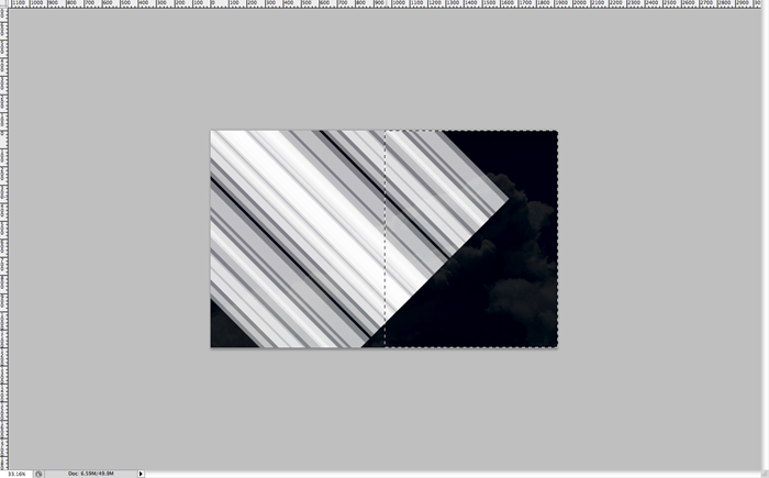
Step 10
Then you can either move your group around so it looks like half of a “V” shape, or you can make a diagonal selection and mask out that region as well so you end up with something like this. You can do this editing on your mask layer by selecting it. Just remember that whatever is in white will show up, and whatever is in black will be invisible.
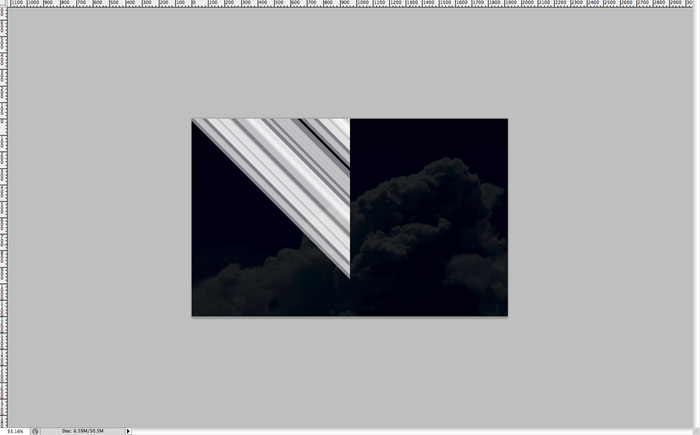
Step 11
Once you’re satisfied with your masking, go ahead and duplicate the group and flip it by hitting ctrl/cmd + T, then right clicking and hitting “flip horizontal”. Now you should see something like this.
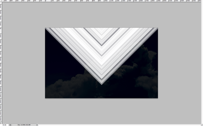
Step 12
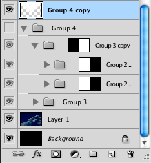
This is a checkpoint. Your layers should look similar to this. Now to save you space and memory, and make sure your computer doesn’t get bogged down by the size of the photoshop document you can duplicate this layer to make a copy, turn off the visibility (in the layers menu… it looks like an eye… click it!) and then flatten your new copy so it becomes a flat layer.
Step 13
Now double click on your flattened layer to open up the layer styles, and jump down to gradient. We’re going to do a rainbow gradient so create something similar by just choosing basic a basic red, orange, yellow, green, blue, and purple and place them however you choose.
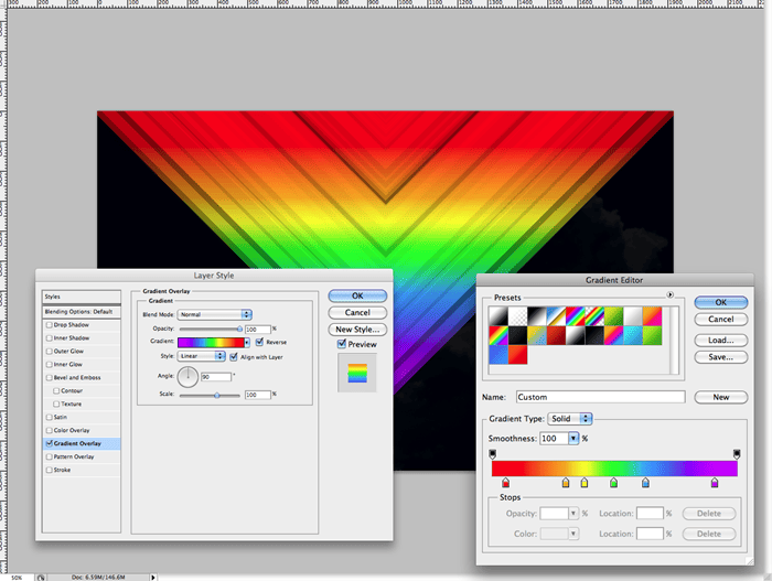
Step 14
As soon as your satisfied with your gradient, duplicate the layer with all the styles and simply drag it downwards a tad.
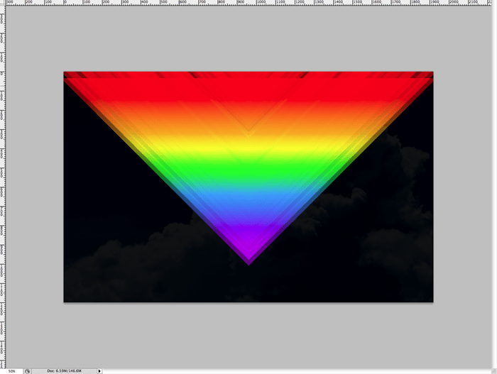
Step 15
Duplicate the layer you just moved down (total of 3 “V” shape layers now) and on this duplicate, set the blending mode to “soft light” Now you’ll start to see some highlighed areas.
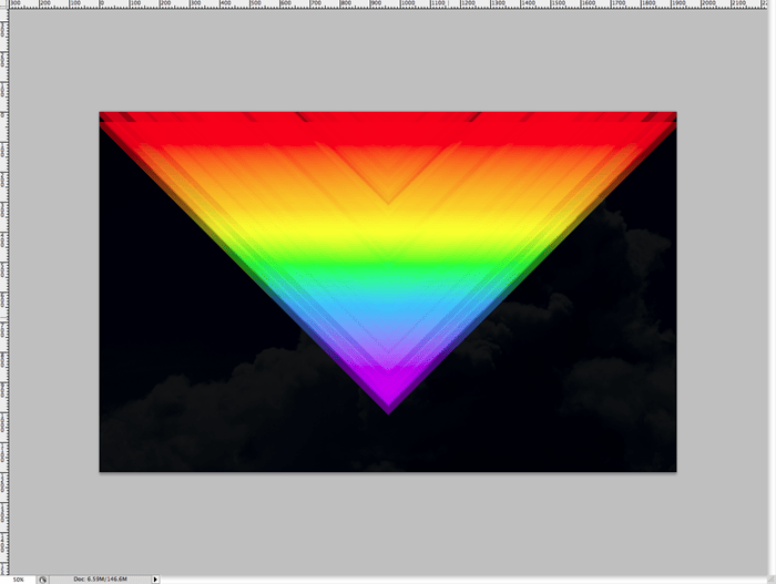
Step 16
Duplicate the top layer that you just put in screen mode. Remove the layer styles, we just want it to be white. Now set the layer blending mode to “Linear Dodge” or “Add”. Now you should see major highlights like below.
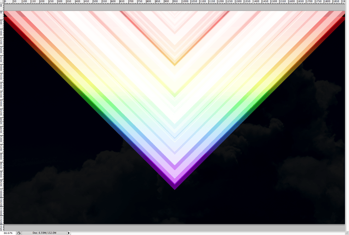
Step 17
The highlighting is very intense though, so we need to take it down a notch. We’ll do this by making a layer mask on the layer set to “Add” mode. Create a mask by clicking the mask button in the layers menu and using a large soft brush with a lowered opacity, perhaps somewhere around 25%, paint blotches here and there similar to this pattern below. This just makes the light look more random.
39 responses to “How to Create a Colorful Retro Poster in Easy Steps”
-
step 9 isn’t clear to me how to cut out that half piece from that shape???
-
Great tutorial!
-
your instructions are awful and unclear every single step is a nightmare to complete.
-
I got lost pretty much step 8 then i tried to follow until step 16 then gave up as you make it quite complicated.
“Duplicate the top layer that you just put in screen mode. Remove the layer styles, we just want it to be white. Now set the layer blending mode to “Linear Dodge” or “Add”. Now you should see major highlights like below.”
At what point did you change a blend mode to screen mode on one of the layers? I didn’t see any step for that.
The tutorial may be ok for regular users but for novices, it’s just confusing. -
DON’T TRY THIS TUTORIAL. SPENT TOO MUCH TIME BEFORE GETTING STUCK ON STEPS 19/20. THERE IS A MISSING STEP OR ERROR AND THE PSD DOWNLOAD LINK IS BROKEN!!!!!!!!!!!!!!!!!!!!!!!
-
Its hard to follow.
-
wow ,its nice post.
-
it’s a great work,thanks for sharing………………
-
wow this sucks why
-
Sir I am unable to understand the step no 20 as after invert the color from white the black the result is quietly different so plz help me.
-
On step 9 I masked it and it did not create a triangle I do not know how you got to step 10
-
how do you invert colours from white to black in step 19?
-
Press Ctrl/Cmd+I
-
-
This is hard!
-
the instruction are really confusing , how many layers are we making, mine pic doesn’t even look like your’s
-
wow very nice.
THANK YOU ! -
I don’t understand step 16 ._.
-
Select the top layer then duplicate it by pressing Ctrl/Cmd+J. Remove the layer styles by going to Layer > Layer Style > Clear Layer Styles. Now, in the Layers panel, change the blending mode to “Linear Dodge” or “Add”. Hope this helps!
-
-
Hey nice tutorial, and nice retro effect!
This is what i do following your tutorial. And adding some other complements.
http://prototype-da.deviantart.com/art/ArcHon-Retro-Lines-403478125?ga_submit_new=10%253A1380338295 -
my layer doesn’t look like yours in step 12. I don’t know why.
-
Sadly you totally lost me at 21.
-
Step 21 is simply a repeat of step 20. You just duplicate that top layer one more time and then change the opacity from 50% to 100%.
-
-
yo whadup your thang worked greaaat pardner.aye the feirce wind gods blow and wail outside yonder window
-
First of all, thank you very for this tutorial. With the help of this, our presentation looks more shiny. Thank you.
-
This is wow but need more knowledge on forming layers
thx -
i did this work in photoshop CS but it did’nt work completely. very hard because i could’nt group it neither turn it to 40 degree or delete it…..so hard
-
Wow!
-
Which layer do you duplicate on step 20? The one with the “Linear Dodge” blending mode, the one with the mask or the one with the inverted mask colors?
i duplicate the layer in which we inverted the colors (step 19), but i, on step 21, get a completely different result than you do.
Any help please?
-
On step 20 you should be duplicating your top layer
-
-
It’s Superb! <3 Loved It :)
Here is My Result :
-
you know i cant do that
-
-
i cant understand step 9 -.-
-
Excellentay
-
Thx!! easy and nice
Author is good -
GOOD
-
Too complicated procedure to create Colorful Retro Poster, actually it was confounding way to make it sans instances.
-
mmmmmmmmmm
-
pls mention the tools too
-
-
Beautiful <3


Leave a Reply