
Many photographers know how to use contrast to benefit their photos. Contrast makes photos eye catching and can even make the most basic looking photos look great. There are two types of contrast:
 | Tonal contrast Many excel at shooting photos with good tonal contrast. A good example of tonal contrast are silhouettes. The foreground is completely dark while the background is properly exposed. This works well because there is a sharp difference between the dark and light areas. |
 | Color contrast Color contrast is used less frequently because many people do not think about it. Capturing a photograph with good color contrast is more difficult than tonal contrast, but it is still quite easy. An image with good color contrast can look great even without any tonal contrast. In the example on the left, the image looks great even with very little tonal contrast. |
What can good color contrast do?
Good color contrast is a good solution when tonal contrast is hard to achieve. Even a tiny area with the opposite hue can make a large difference. Analyze the two photos below. The image on the left looks quite boring, but once we add back the colors of the red flowers, the image looks a lot more interesting.

How to get the best tonal contrast
The best tonal contrast contains complementary colors (opposite colors) and high saturation. Two colors on the opposite sides of the color wheel creates contrasting colors. The saturation of the colors affect how prominent it is over tonal contrast.
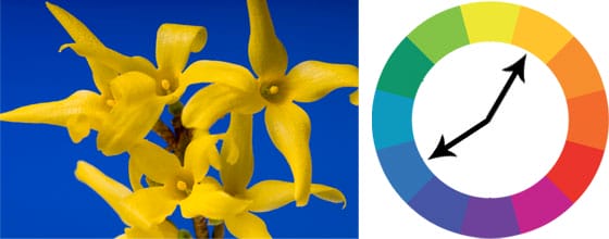
Contrasting hues
In the image below, the color contrast is good because the colors are almost opposite of each other. The image is loud and grabs attention.
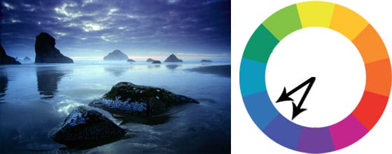
The image below has low color contrast but it still looks great because it has good tonal contrast. Also, low color contrast is not always bad. Low color contrast makes the photo quieter and well for the scenery photo below.
You can make your photos more striking by increasing the color contrast. Below is an example that compares the color contrast. With less color contrast, the image will look dull and quiet. High color contrast makes photos look striking.

Saturation
The color saturation affects the intensity of the effect. The more vibrant the colors, the more color contrast. A color photograph can be separated into tonal information and color information. When you combine those two, you will end up with a regular color photo.

How prominent the color contrast is depends on how high the color saturation is. With less saturation, the tonal contrast becomes more noticeable. With more saturation, the color contrast takes over.


Simplicity
Color contrast also works better with fewer and larger color masses. In the image below, the checkboard pattern has weaker contrast because similar colors are separated and there is an even number of colors (50% orange, 50% cyan). The image on the right has stronger contrast because there are only two areas and more of one color than the other (75% orange, 25% cyan).
5 responses to “Create Striking Photos with Good Color Contrast”
-

Thank you! Would you recommend the book “Color Correction Handbook” by Alexis Van Hurkman to learn more about color?
-
Thanks for finally writing about this. Loved it!
-
very simple and very refined info
-
nice
-
only one word its beautiful
Leave a Reply to armukulCancel reply