


Step 20
Next a little black and white () with a lowered opacity can give it a darker mood and a more “Classic” look.

Step 21
However I am not going for that look, but the black and white layer placed before the adjustment colors will give an interesting look. So let’s bump the vibrancy back up with a Vibrancy () layer to get some of the brighter colors to pop for our gradient maps.
Step 22
Finally, I usually end with Gradient Maps () to unify the overall image with a similar set of colors, the gradient presets work very well here and are a popular choice for myself but must be eased in as Overlay blending modes and lowered opacities.

And we’re done! Congrats on you’re image! Hopefully, you learned something new here today and had fun creating this humorous and whimsical image!
Download the PSD
Dog Portrait.zip| 213 MB
Final Results
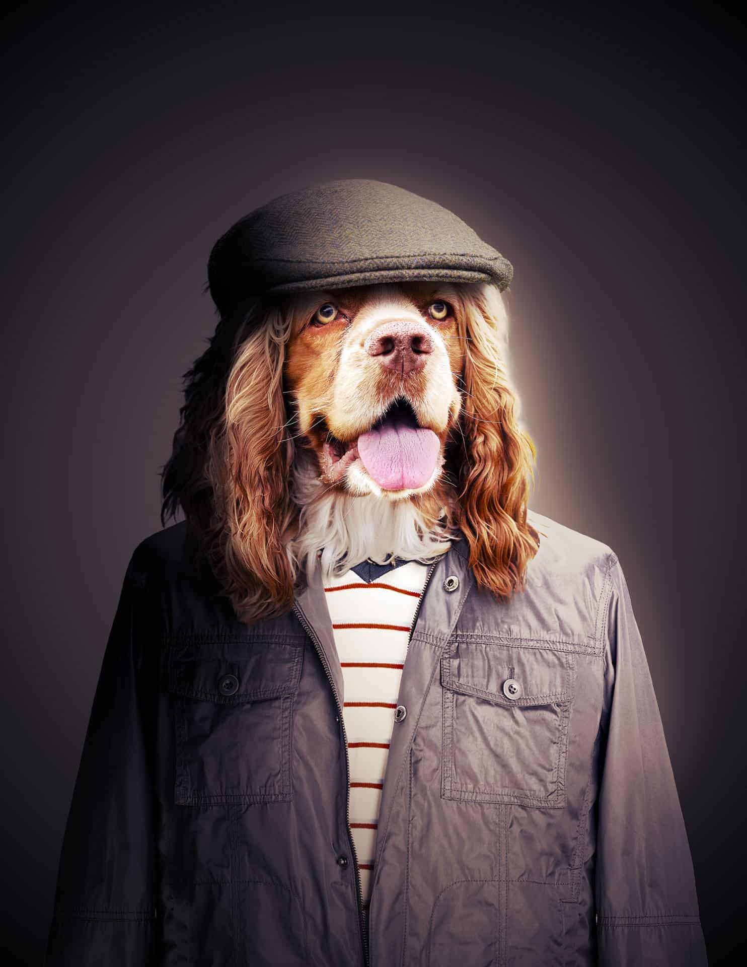
Tutorial by Jacob Pryor

End of tutorial


