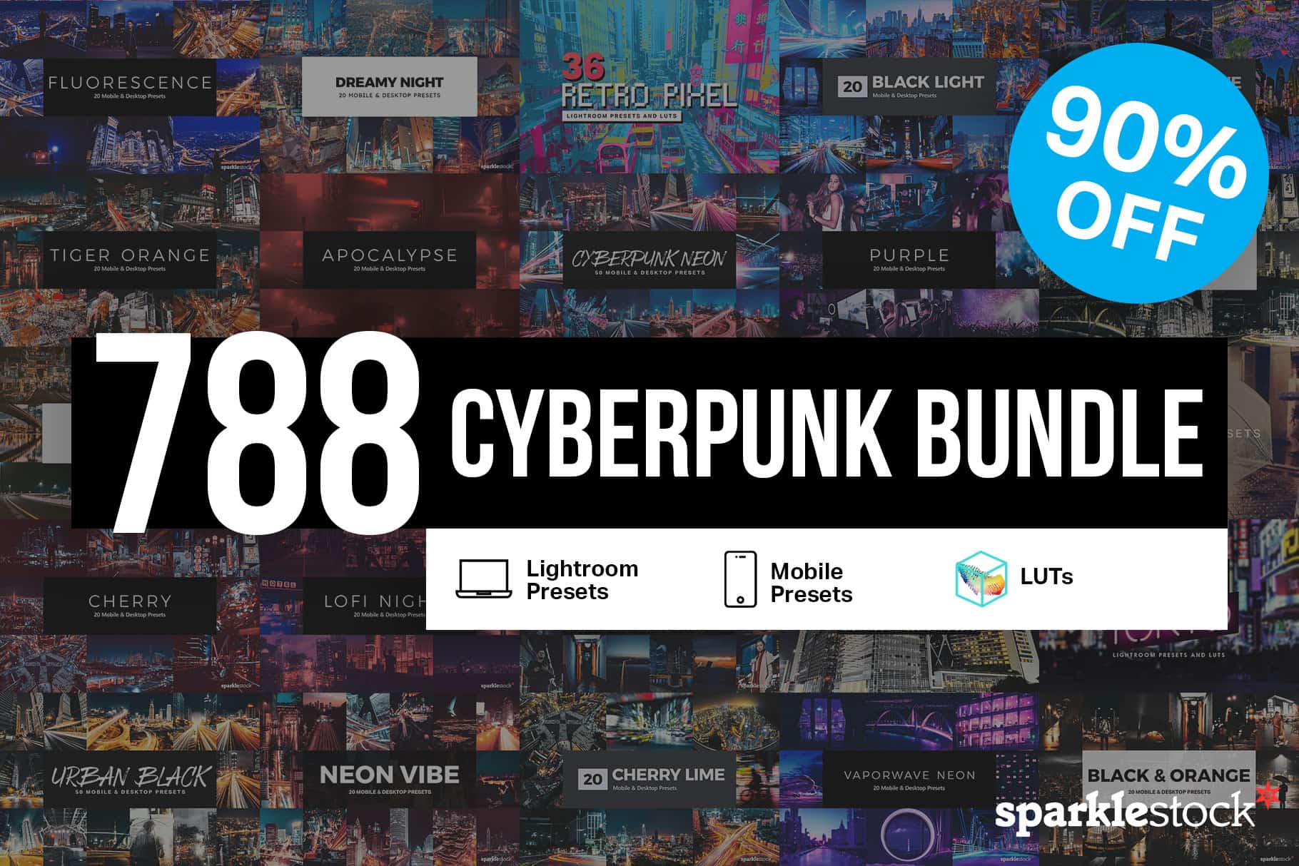
Make your artwork look like they're from an alternate universe. These Cyberpunk presets work with Photoshop (via the Camera Raw filter) and Lightroom. Download all 788 presets for 90% off.
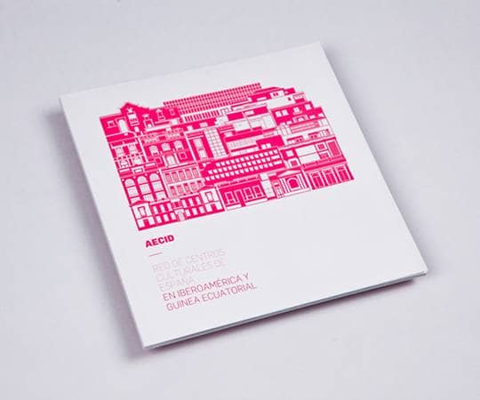
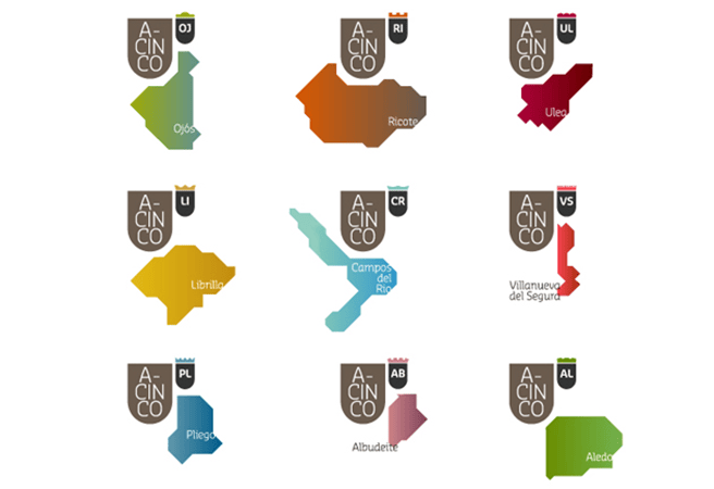
When and how did you train for graphic design?
At university, where I learned design theory and composition. It was my great honor to have brilliant and dedicated professors in both areas, who guided me throughout my career. When I worked for a design studio, I learned things such as project management and administration, dealing with clients and how to do a professional and sophisticated presentation. However, the most important technique that I have learned about design is from looking at other designs, learning from other designers and artists, from magazines, books and the internet. The more input I receive, the better output I can produce. This is the way I improve my artistic conceptions.
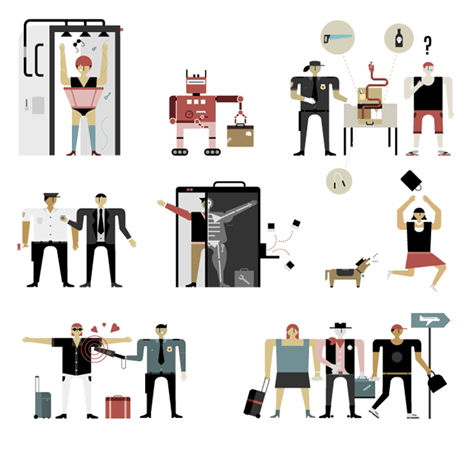
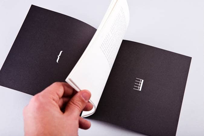
What inspires you to create?
I can't say that there is a specific thing or object which has inspired me, but throughout the whole process, there have been a lot of things that I have found inspiring, from being in a positive mood to a nice picture. Inspiration can come from everywhere unexpectedly. So I listen to everything, watch everything, and read everything for as long as I can. When starting a new project, the first and foremost thing that I will do is think of the right, correct and appropriate style that my intuition suggests for that particular project. I don't really believe in complicated methodologies, I always trust my own intuition and personally, I think it is the best tool.
What tools/apps do you usually use in creating your projects?
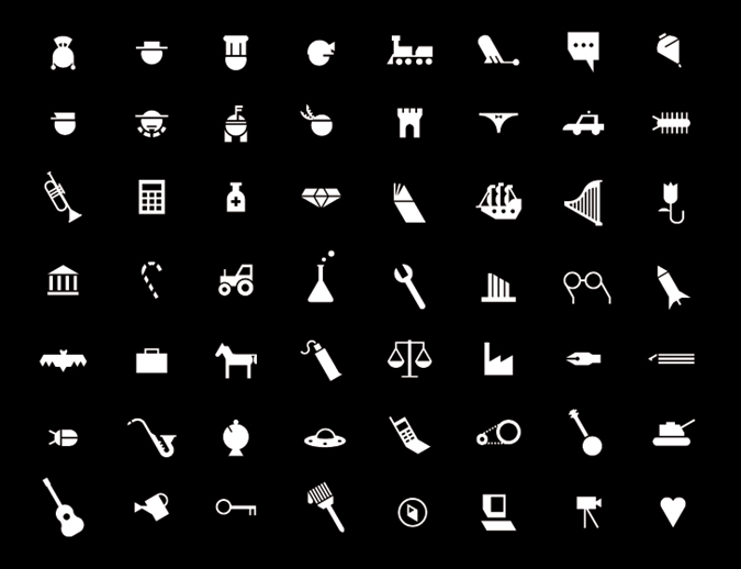
My principal tools are pencil and a black ball point pen from Muji (A Japanese brand). Firstly, I start doing a quick sketch on a paper, in order to achieve the perfect composition that I like most. Then I digitalize my idea from paper to my computer (Mac), if it is vector work then I will use Freehand. I will use InDesign for laying out publications. For retouching, editing, adjusting photos then I will use Photoshop.
Your style consists of simple lines, shapes and colors. Why do you explore such aesthetics?
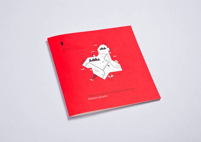
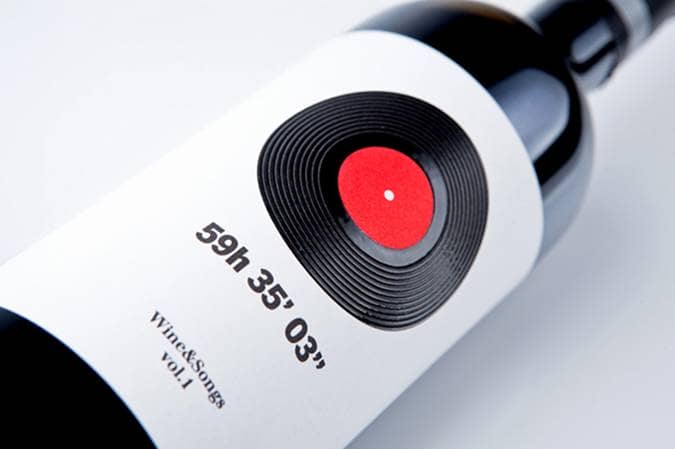
I believe a good design should be always simple, precise, clean and straight to the point. I don't really like designs with exaggerated details and ornaments, which usually abound. Simplicity is the best. I was always interested in the ethical side of design. Personally, using a few basic, simple shapes and colours is the best way to reach your audience and convey the right message - because you are trying to tell something without artifice or special effects. A design should be an appetiser, not a buffet. I would like to dedicate my profession solely to design icons for signaling. From my point of view, it is the work that consists of everything in design: synthesis, illustration and social function. Imagine, you can tell a full story, the functionality, and the concept behind it through a small icon.
4 comments on “16 Clean and Sleek Icon Designs by Romualdo Faura”
Amazing. . Very nice,
I enjoyed reading this interview. "Simplicity is the best." I totally agree. I like my work simple and clean but modern.
Nice stuff!
excellent artwork romualdo!!